Answer Communications Branding / 润尚品牌设计
Answer Communications is a marketing and communications company based in Shanghai, servicing clients in the luxury market, with a focus on cosmetics and fashion industries. These industries in particular are highly competitive in terms of marketing spend and how to best communicate with consumers.
Answer Communications 是家位于上海的市场推广顾问公司。他们服务的品牌大多集中在美妆产品和时尚产业等奢侈品市场。这些领域的市场推广往往不但在花费上竞争强烈,更重视找到品牌与消费者间沟通的最佳方式和渠道。
Also the marketing landscape in China is evolving at a furious pace, corporations need to keep up and adapt to new communication channels like WeChat and Weibo (Chinese Whatsapp and Twitter) as quickly. Plus the fact that Chinese consumers are becoming increasingly savvy and resistant to brands pushing through their messages, consumers need to feel they are engaged in a dialogue with the brands, rather than being talked down to, or feel that they are being hustled to buy.
Answer, bridging the gap between brands and consumers, needs to demonstrate they are at the forefront of communications, that they can initiate the dialogue, that they can sustain the conversation between brand and consumers.
另一方面,中国的市场大环境以惊人的速度进化着,企业需要快速大步跟进并适应诸如微博、微信带来的新型市场渠道。再加上中国消费者同样成长迅速,他们逐渐对品牌强行推广的信息产生反感;与被说服和被强推消费相比,他们现在更需要感受到自身是可以参与到与品牌的对话里的。
Answer就好比是品牌和消费者之间的桥梁,他们需要展示自己是站在该沟通领域的最前线,他们是品牌与消费者之间对话的始作俑者,他们将保持该对话的持续。
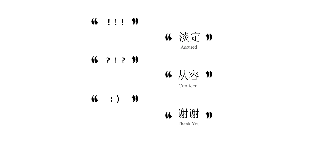
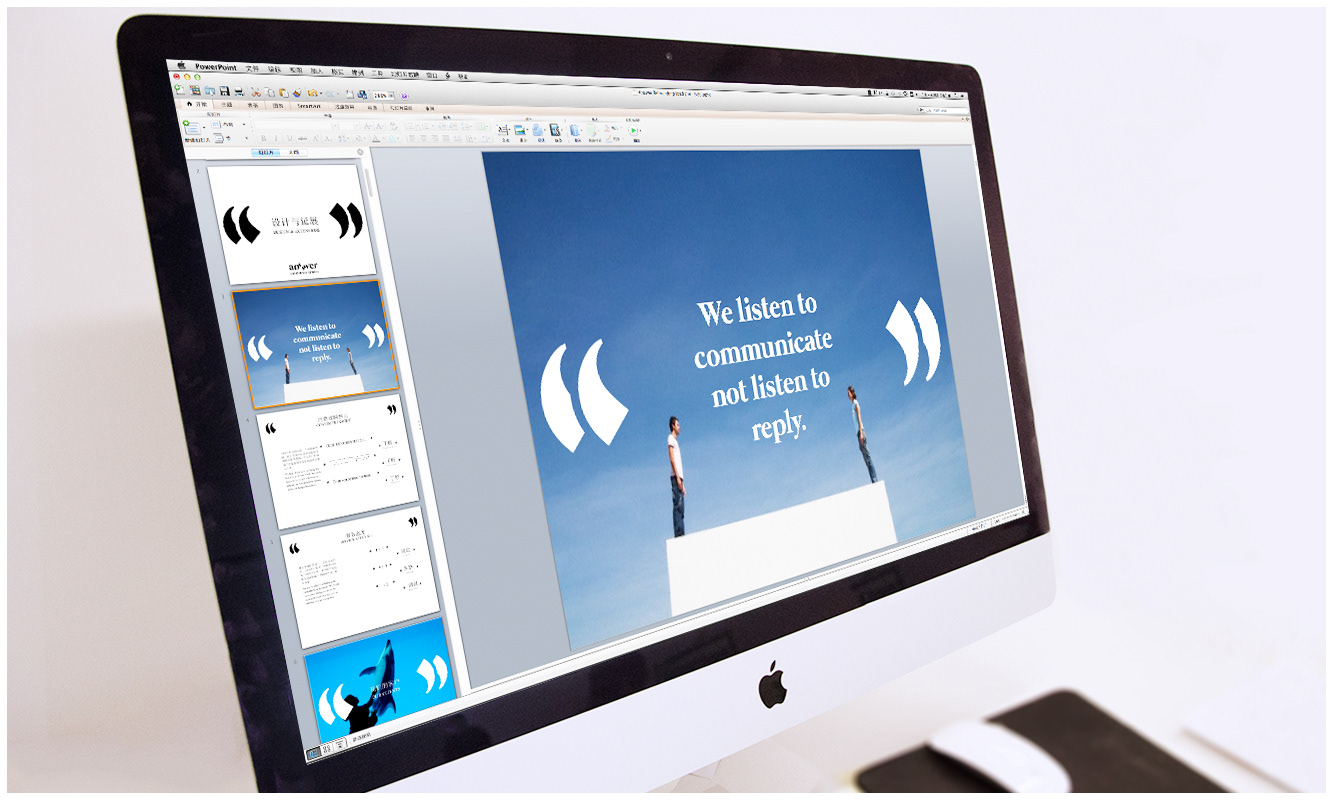
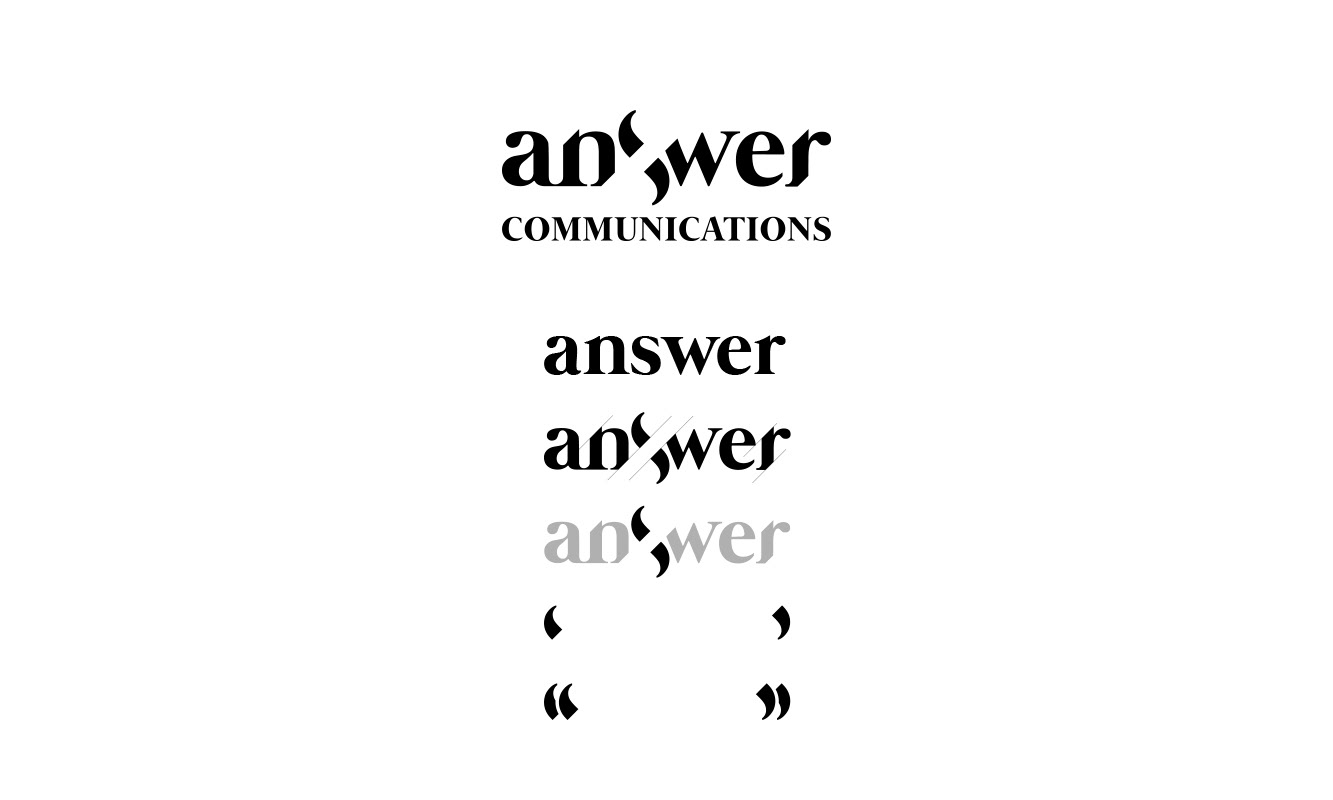
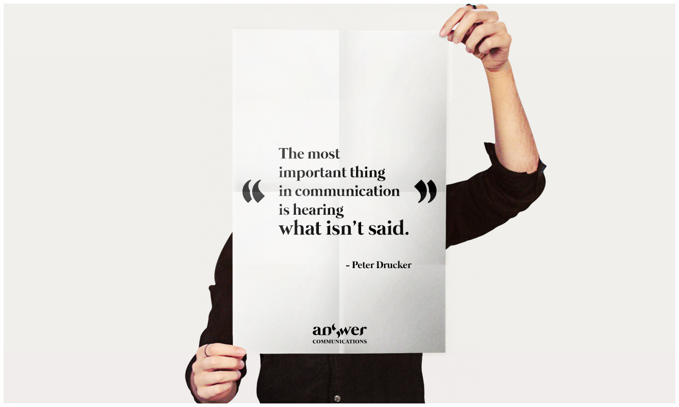
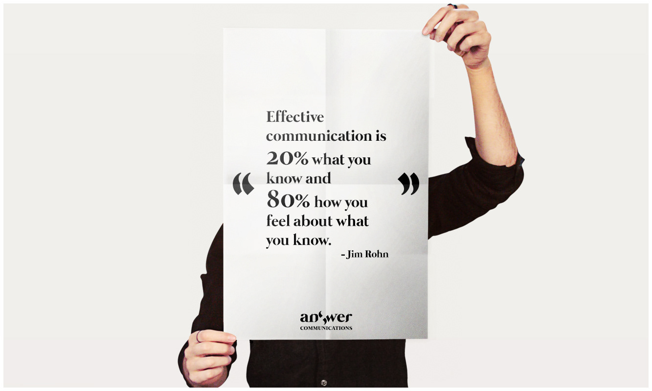
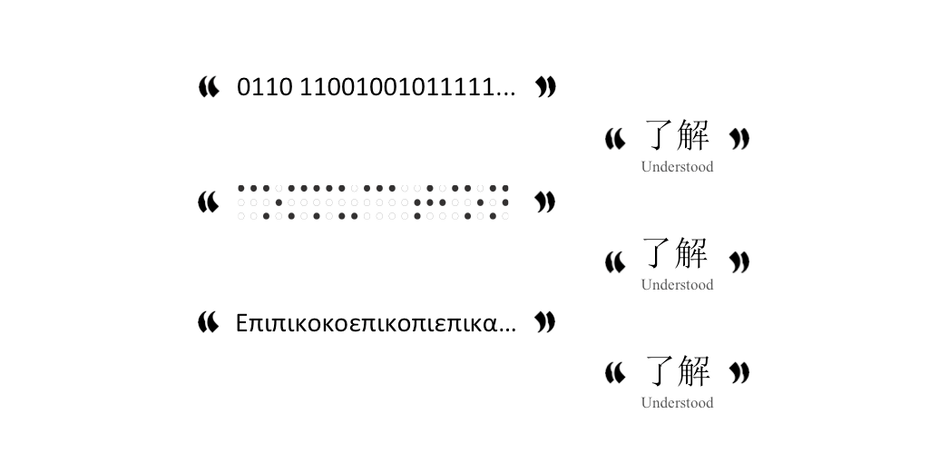
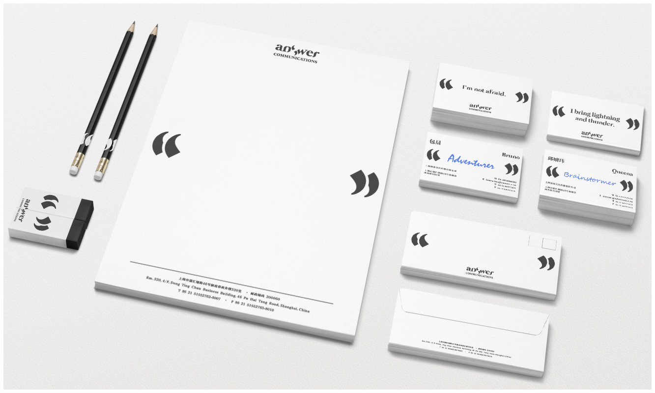
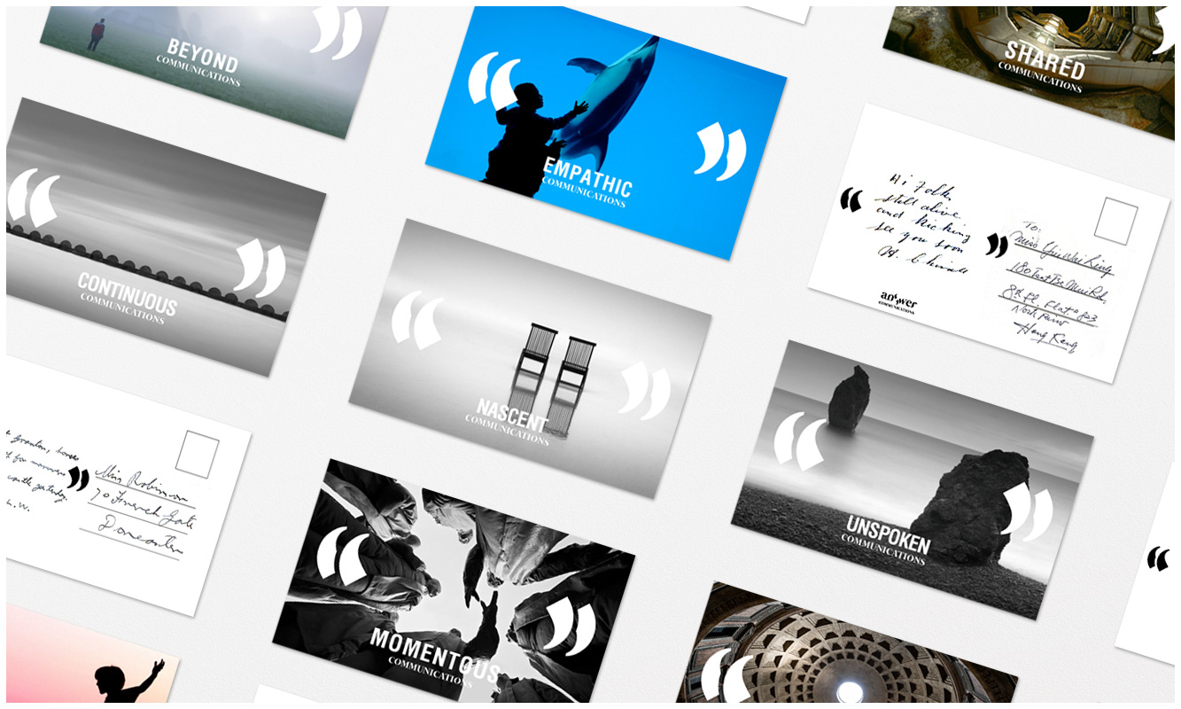
Hence we have chosen to express their branding with the process of communications itself. Two quotation marks come together to form the S in answer, they open up in the middle to start the conversation, and they evolve into double quotation marks to hold the contents of the communication.
Communication is not just verbal, it is visual, it is tactile, it is also the unspoken, the heart felt, the space in between. That is what we set out to express in the branding.
所以我们选择用沟通过程本身来表达 Answer 这个品牌。两个引号以某种方式结合组成 Answer 中的“S”,它们从中打开释意对话的开始,它们变形组合成双引号承载沟通中的不同内容。
沟通不仅仅是语言上的,它是视觉上的,感触上的,或者是无法言说的,心灵上感受到的,它就是那双引号中的空白。这是我们表达描述Answer 这个品牌的出发点。
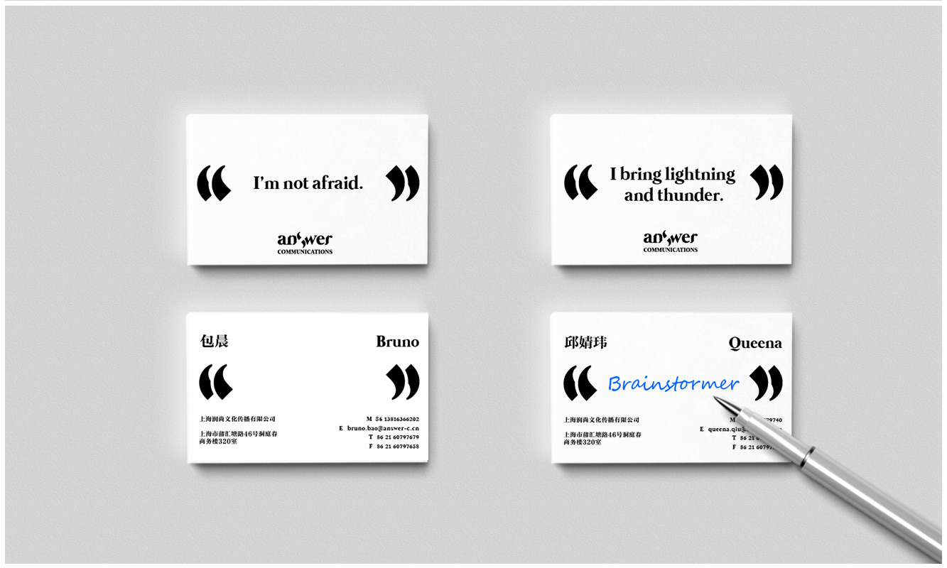
The namecard is often the conversation starter in the business process. The front side features a quote from the employee, the back requires input from the other party. At the end of the business meeting, the receiver is encouraged to write what is thought about the other person, what kind of person he/she is, what was most memorable about him/her. This interactivity is our reinterpretation of the business communication process.
名片在商务过程中常常是对话的启动者。名片的前面是持有者的特色格言,背后则需要另一方来填充。商务会谈的尾声,名片的获有者将被鼓励在名片上写下对名片持有者的印象和看法。这个互动过程意是我们对于商业沟通的从新演绎。


For ideas in the digital realm, they need to be more fun and playful, so that user-generated content can catch on in the social media. It is a variant of our postcards, except that users take the photos themselves and type in one comment to express their take on communications. They can then send the images to their friends or post it online. From cute cats and dogs, to inane signages, and inexplicable fashion disasters, they can let their imagination run wild and do a running commentary on communications.
对于数码领域里 Answer的概念应用,我们希望它是即有趣又好玩的,这样用户生成的内容就可以传播于社交媒体上,将 Answer 的理念带到各个角落。这款 App 的功能类似电子名信片,亮点在于用户可以拍照后留言评论,而评论以 Answer 特有的双引号表达着个体极富创造性地沟通。它们可以是可爱的宠物们,莫名其料的公共标识或者令人费解的时尚灾难,用户在用手机拍照记录留言评论后可以发给自己的朋友。使用者在任由想象力飞扬的同时进行着极富趣味的沟通。
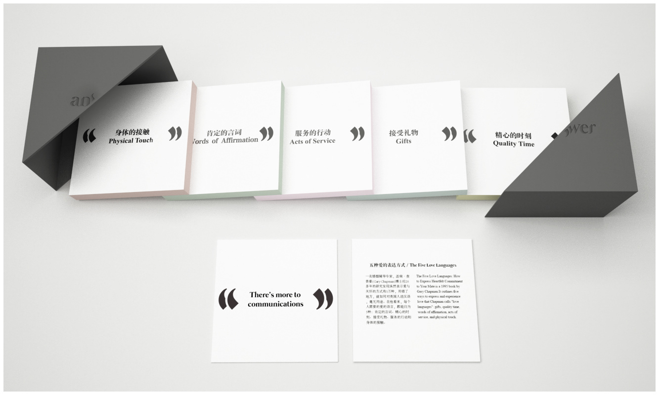
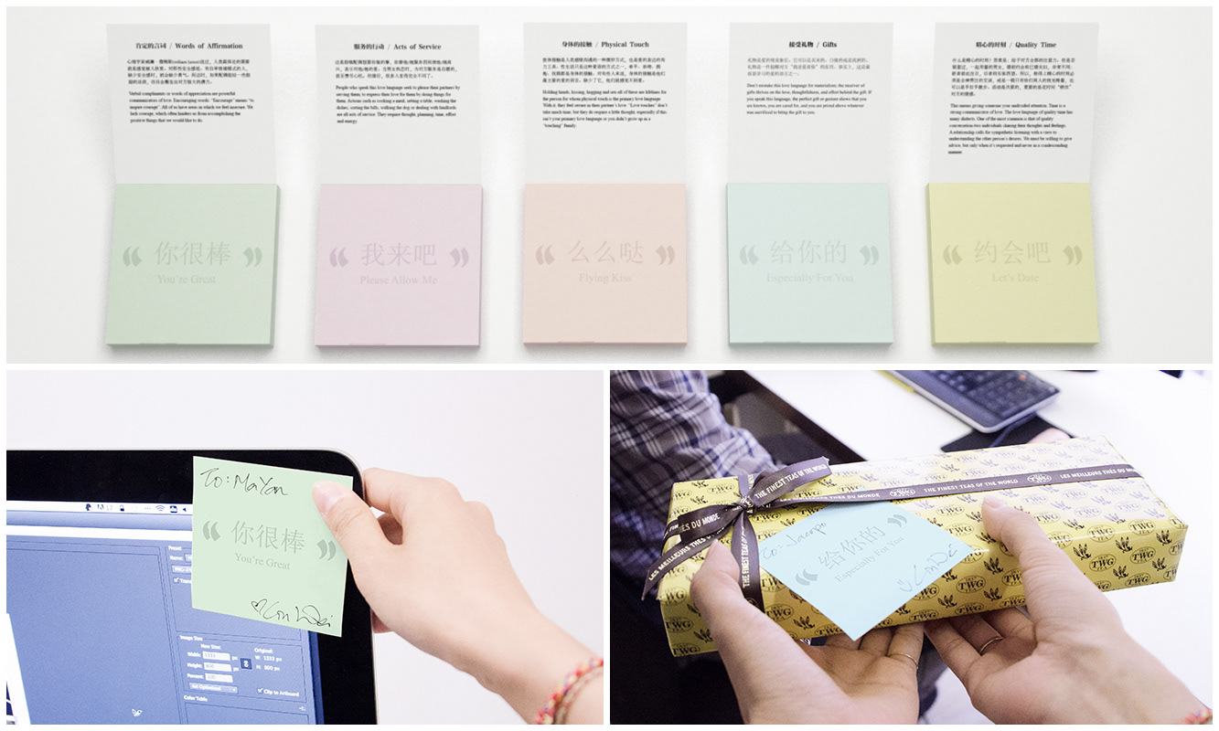
We want to show our corporate partners that we care for them, and truly an emotional connection is the surest and most basic component of any relationship, especially a business one. So we used Dr Gary Chapman’s 5 Love Languages to empower the end user to more easily communicate their love to others. 5 post-it packs each embody one love language. For people lousy at praising, they can stick ‘You’re Great’ on someone’s computer monitor, hard to verbalize but easier to stick a post-it and express one’s appreciation. They come together in a pack of 5, all in a black box. The embossed logo in the middle opens up to facilitate this communication of love.
Answer 希望找到一种方法/礼品表达对合作方们的关心。这种真诚的情感联系在任何人际关系里都是最确实的最基本的组成元素,特别是商务关系。所以我们选择用Gary Chapman 博士的5种爱的语言理论。该礼品可以帮助使用者更容易地对其他人传递自己的关心与爱。5包便利贴,每个都承载一种的爱的语言。比如:拙于赞美人的人,可以将“你很棒”的便利贴粘在对方的电脑上,难于启齿的话轻易的借由便利贴表达了不善言辞的欣赏。5包便利贴为一系列,被黑盒子包裹起来。浮雕处理的logo 延续着“开启对话”这一概念,只是这次开启的是关于“爱的沟通”。
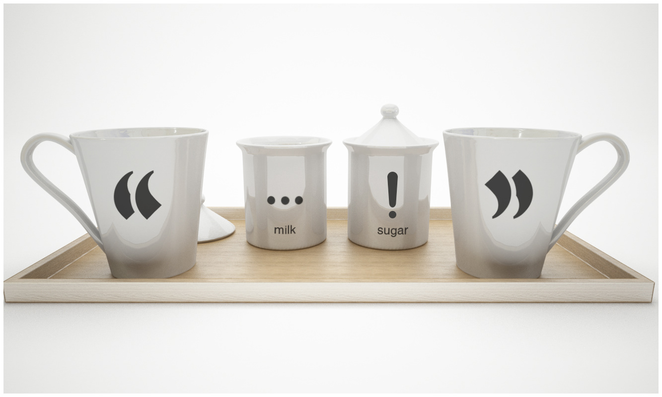
Two persons holding two coffee mugs with one set of quotation marks each, each embody one side of the conversation. The conversation is the invisible space that is between them. On a tray, the milk and sugar adds their own flavour and expression to the conversation. The mildness and calm of milk, sit together with the excitement and surprise of sugar, and bracketed by the mugs on both ends.
印有不同方向双引号的咖啡杯象征着对话的双方。他们之间的对话就是双引号之间的那个无形的空间。托盘上的牛奶和糖将自己代表的味道和表达方式加到对话中去。牛奶的温暖和安定,糖的刺激和惊喜,相互比邻,被双引号咖啡杯囊括在一起。