
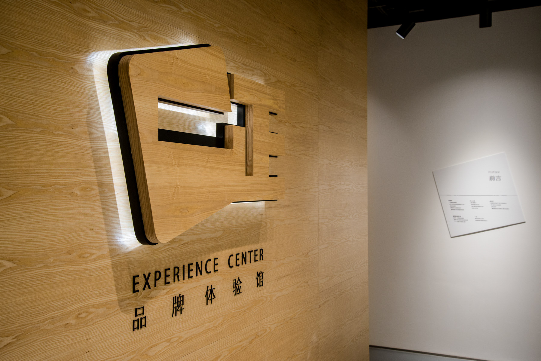
Yizheng Stationery is a market leader in children's eraser in China. This experience centre, though grounded in this category, is not targeted at children. This is part of a broader B2B communications brand building framework.
一正文具是中国儿童橡皮品类的市场领导者,但这个体验馆不是针对孩子们。这是一个整体 B2B 品牌策划框架的一部份。
Project Background / 项目背景
As manufacturers in China transit from OEM, ODM to being brand owners, the founders need to embark on the often unfamiliar process of brand building. This process of building their brands from scratch is an onerous task, and with so much to do, knowing where to start, and subsequent project phasing is key. Here we decided to embark on B2B communications first, before tackling B2C touchpoints. It is more direct, and cost effective, without taking too much time tackling market segmentation and product line architecture issues. Especially important for small medium enterprises (SMEs), is for the brand consultants to deliver in as quick a time frame as possible a solid response and ROI for the inception phase. Only then will the SME be confident enough to embark on the next phase in the long process of brand building.
中国的制造业都在转型中,从代工、代设计、到经营自己的品牌。创始人到了这个阶段,知道这是唯一能够提高附加值的办法,但往往是茫然的。从零开始打造一个品牌,不只是做什么的问题,精力和经费经费都是有限的,先做什么是更重要的问题。在个项目我们从 B2B 的品牌沟通做起。相对于B2C, 这是简单的,关于要传达的信息,选择的沟通媒介,需要的推广费用。更重要的是,针对于民营企业,品牌策划方需要最快的速度让甲方看到成效,才能更有信心得在漫长的品牌建立的旅程上信心满满得再跨出一步。
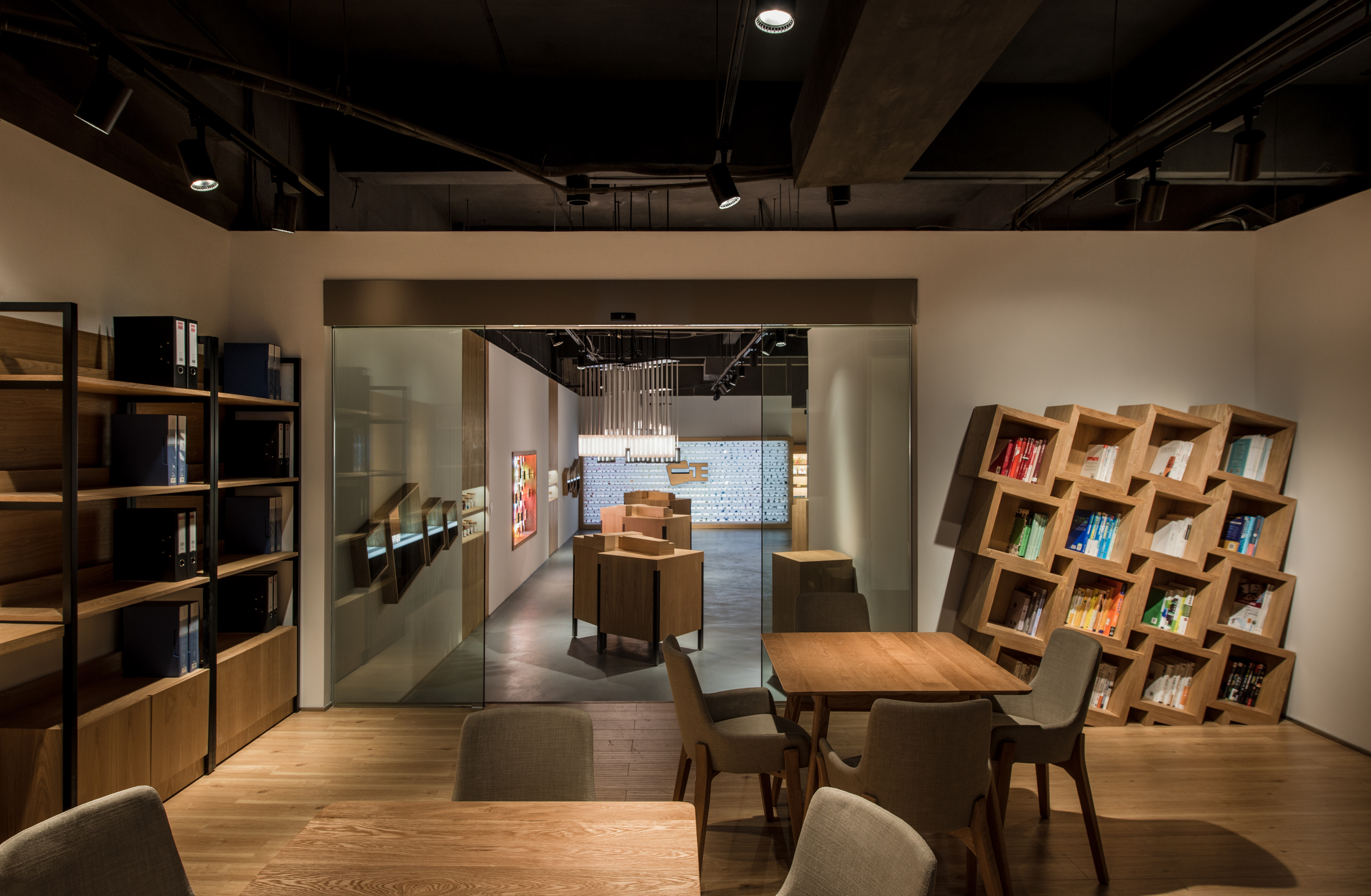
Spatial Layout / 区域分布
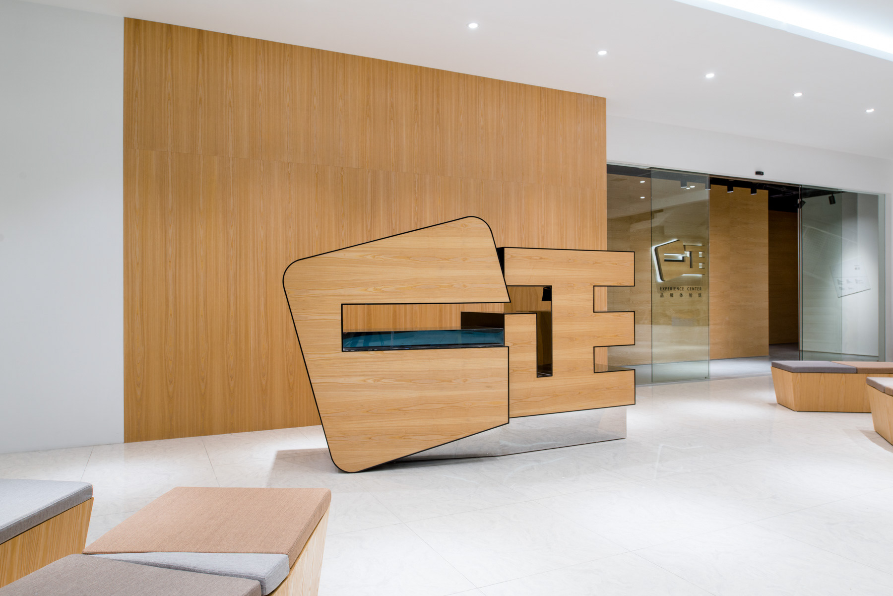
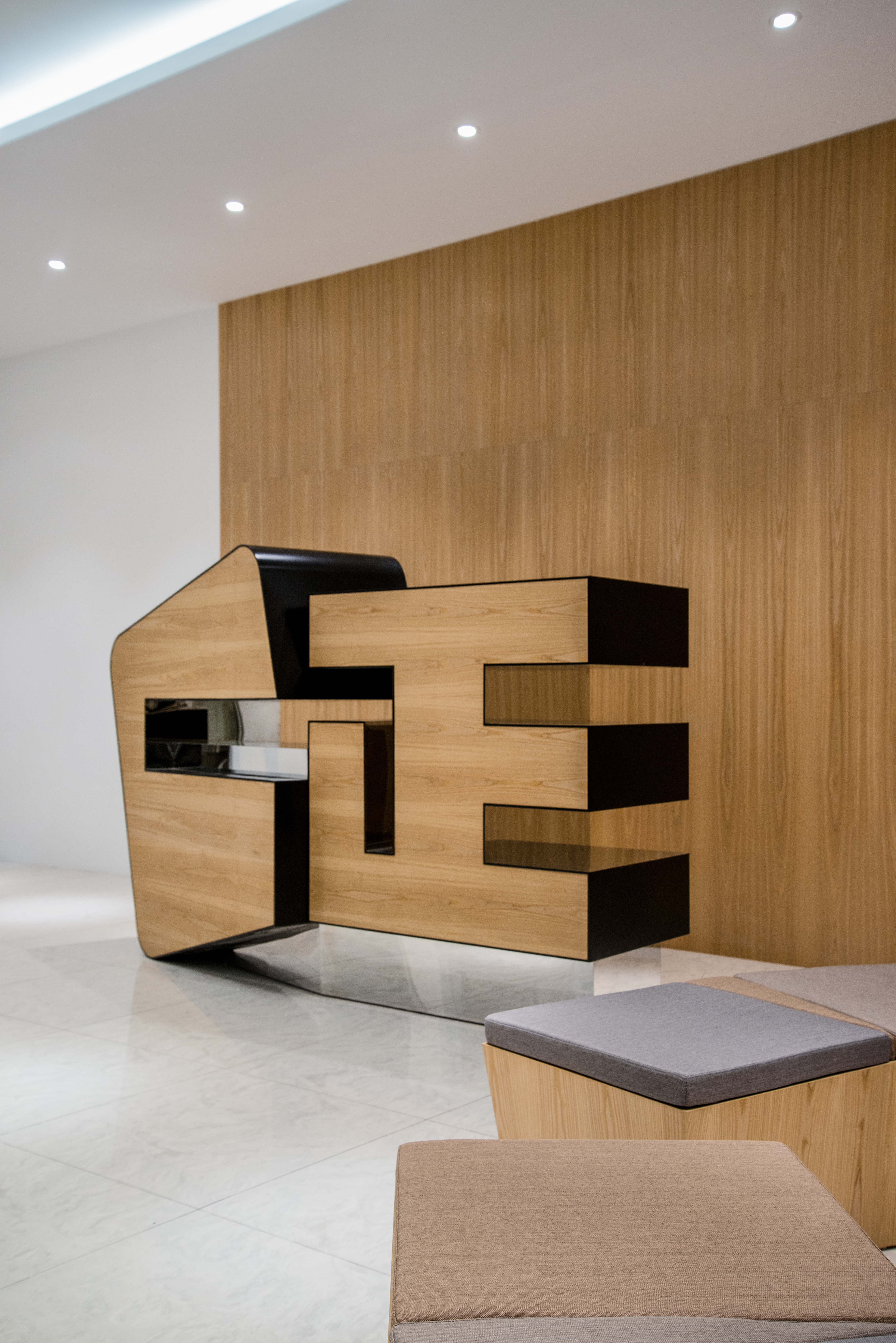
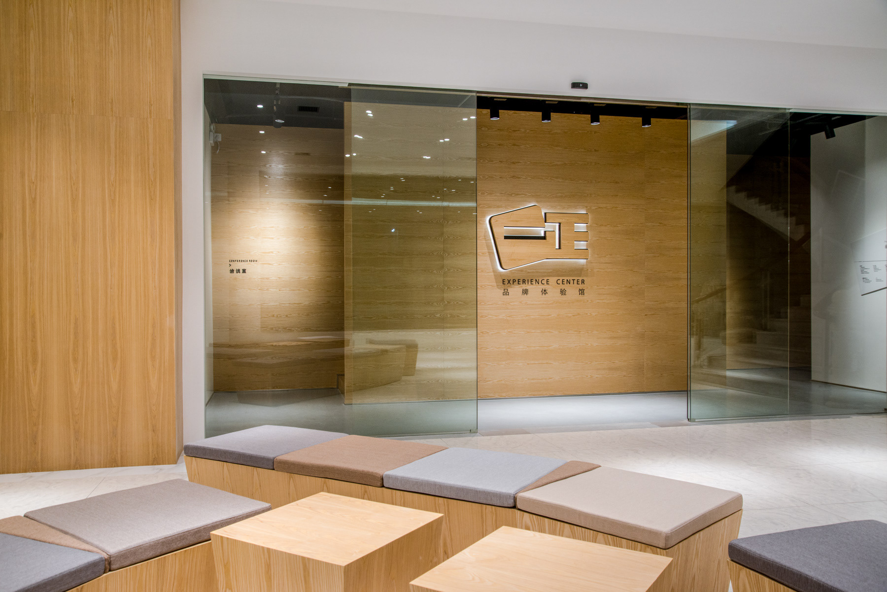
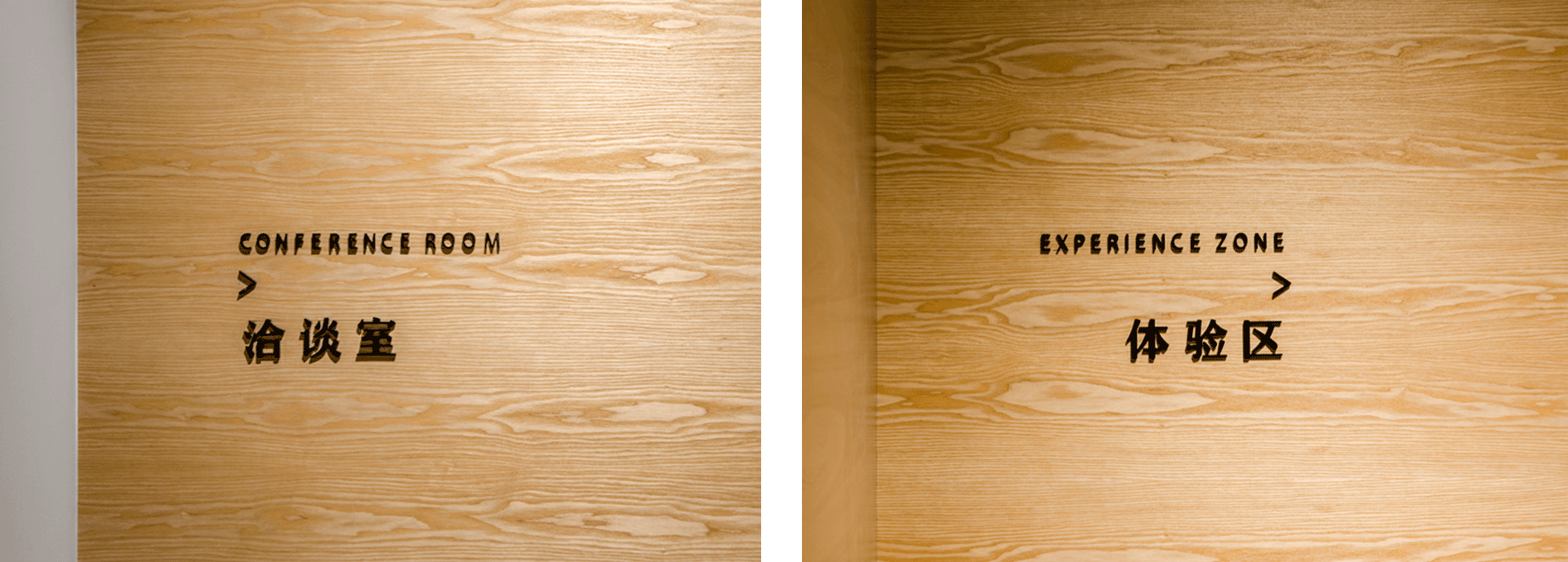
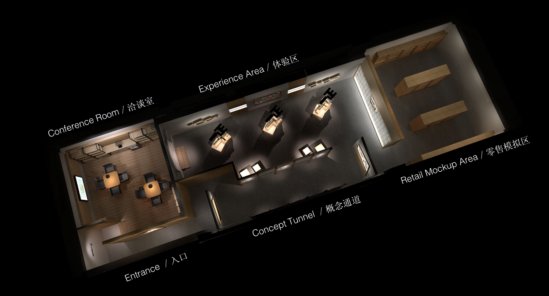
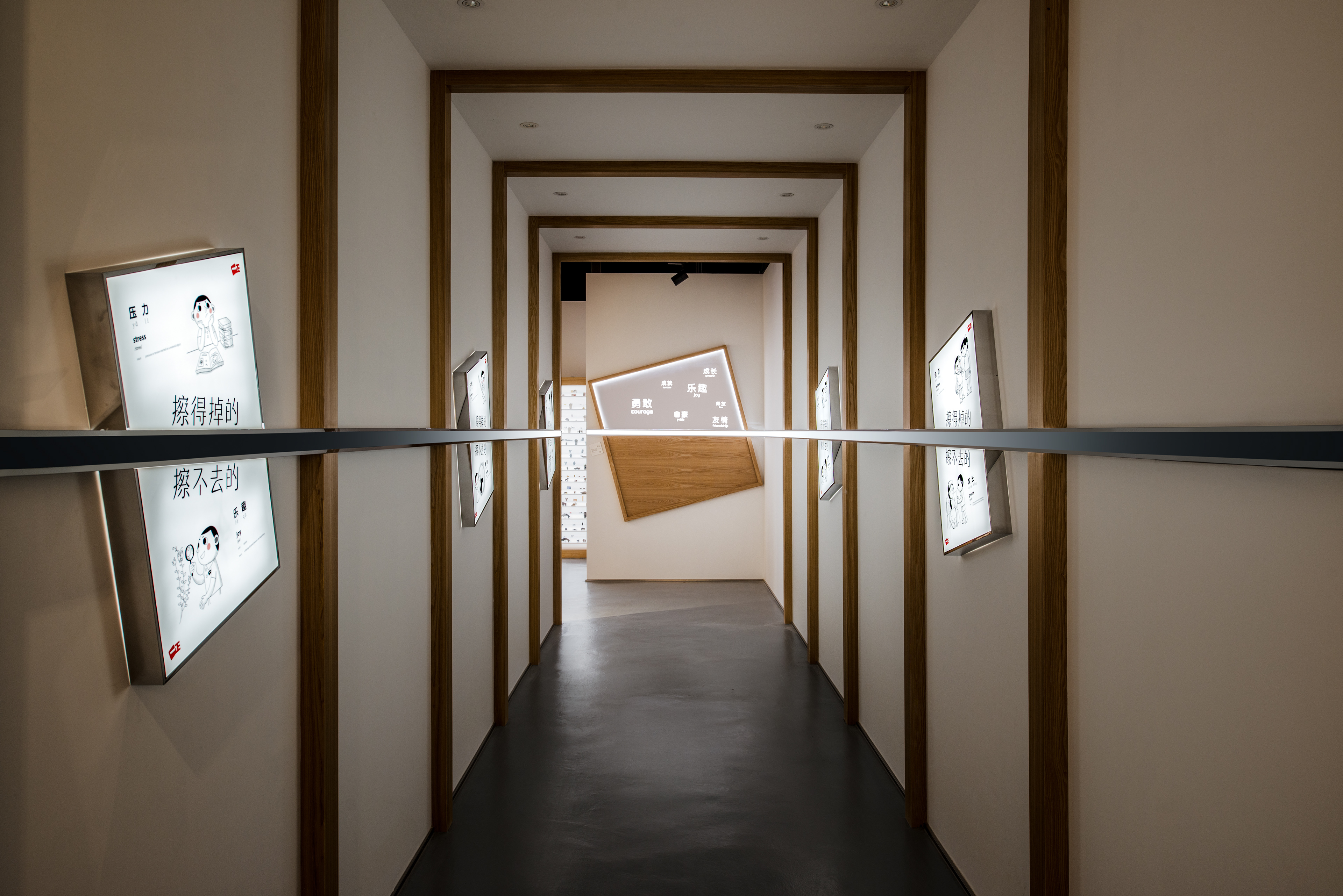
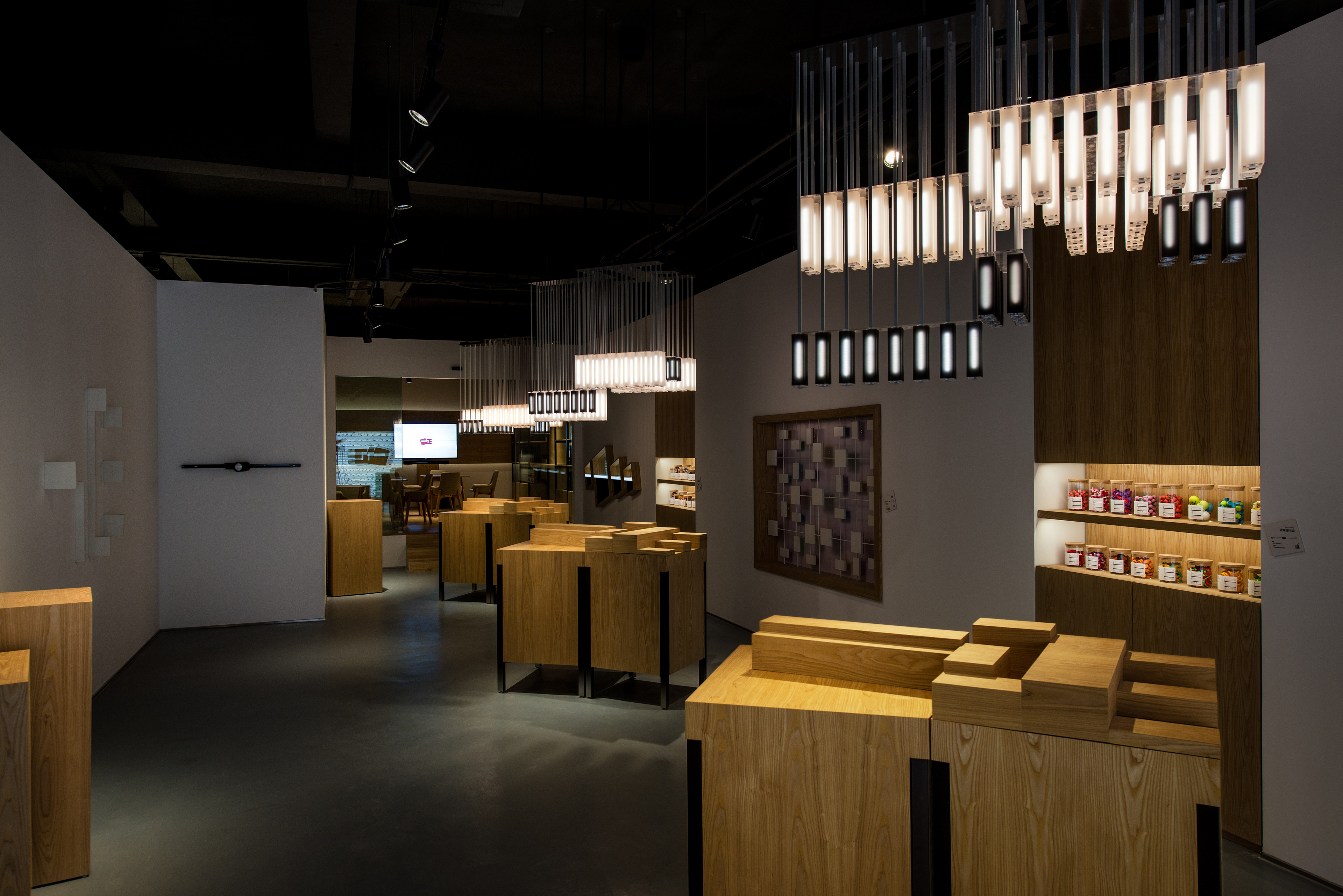
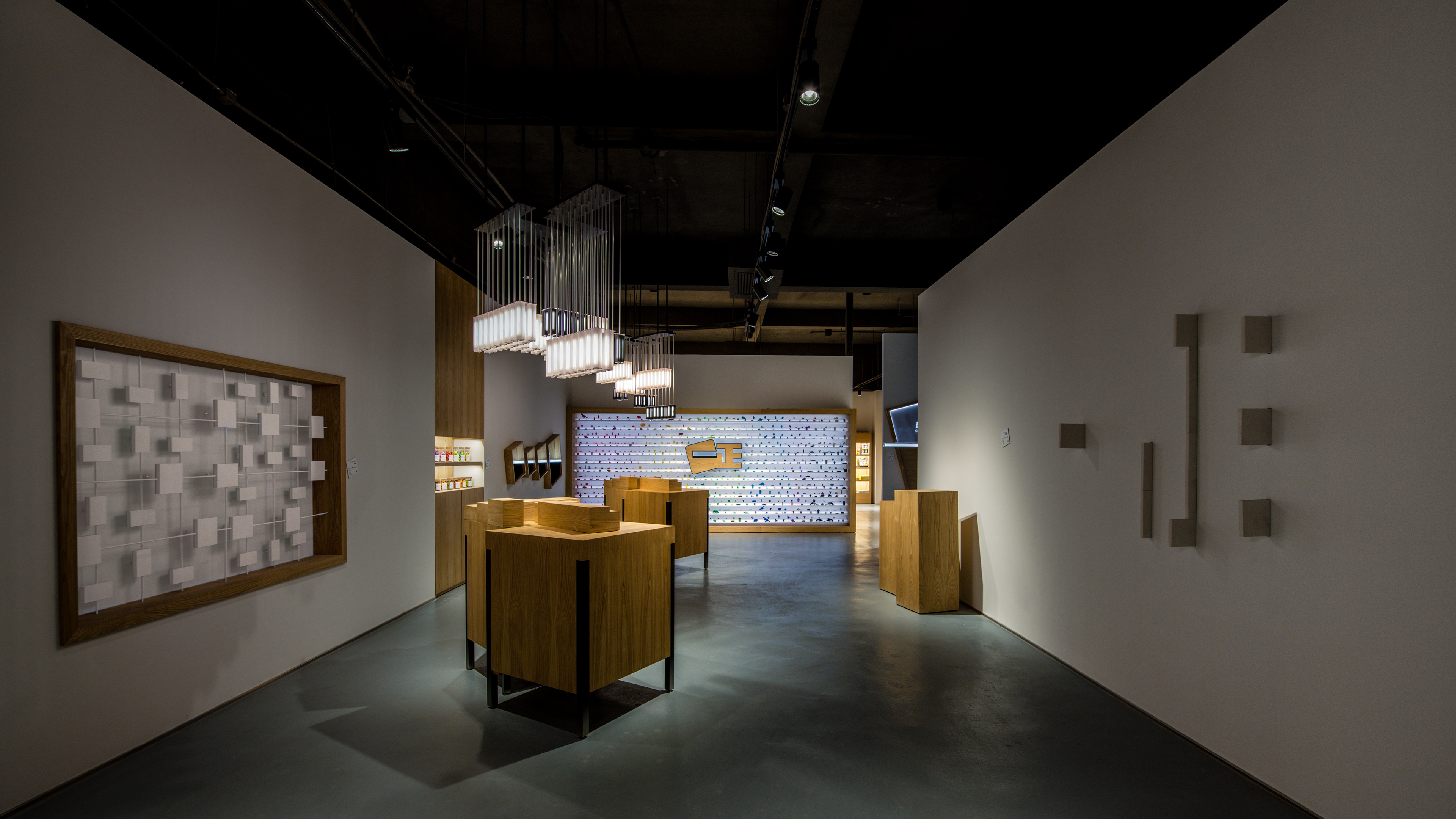
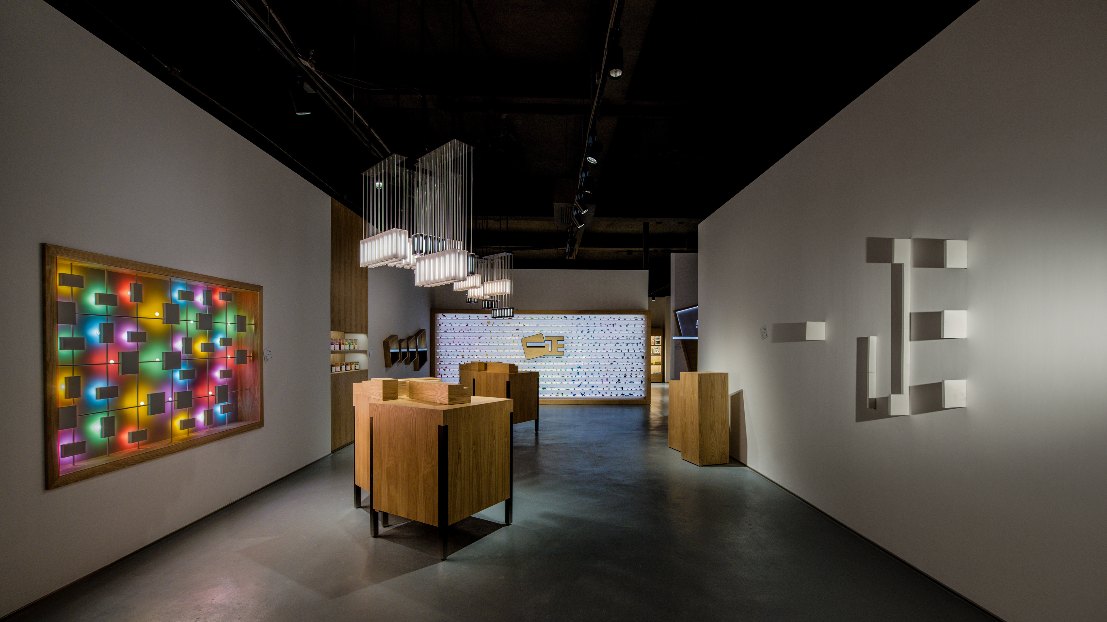
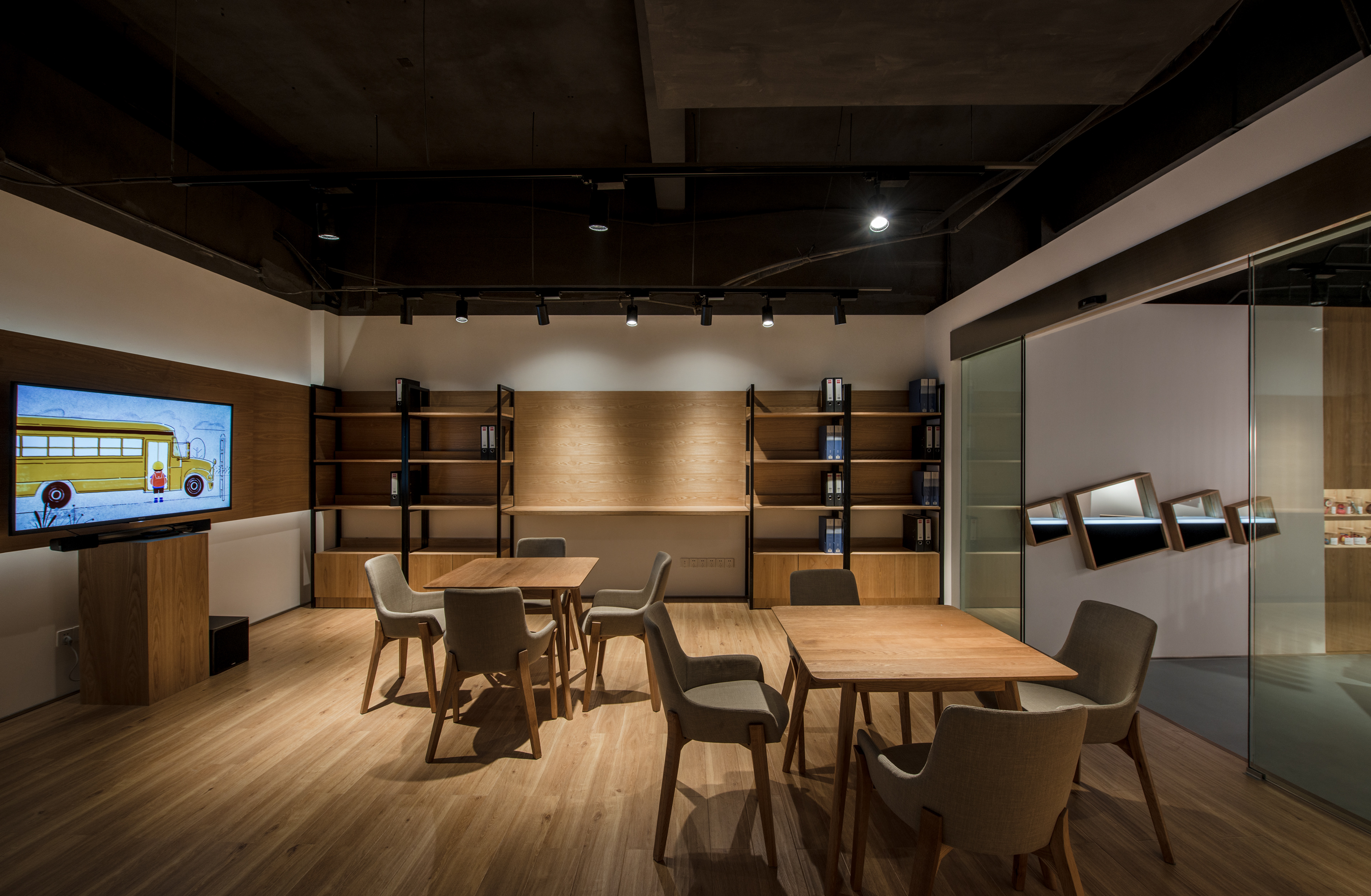
This experience centre is situated in the factory, it is meant to be part of an entire sales journey. As such, the spatial layout and circulation is meant to enhance this experiential journey. Upon arrival, they past through the lobby, enter the experience centre and turn left into conference area. Here they rest, freshen up take a drink, and watch the brand video. Thereafter, they leave to visit the factory, to see for themselves the level of automation and production sophistication. Re-entering the space, they turn right, passing into the concept tunnel, and into the retail mockup area. It is important for business partners to understand the diversity of their product range. The journey continues into the experience zone and back to the conference room where the client will address further questions and conclude the business discussion.
因为这是在工厂的体验馆,得考虑到商务访客的参观流程、动线。客人抵达工厂后,进门先左转,先到洽谈区,小歇片刻,喝个水,看品牌视频。之后出门参观工厂车间,直观了解工厂产能、自动化优势。参观完不同制造、包装车间后,再次进入,这次右转,经过概念通道,再到零售模拟区看看在销商品。这里展现的是产品的丰富性和品类的多元性。之后参观体验区,再回到洽谈区,做最后的解答和沟通。
Our Approach / 我们的出发点
In this phase, we left the logo largely untouched. Our aim is to bring the brand to life, making it relevant to both their partners and consumers eventually. Corporate brand experience centres targeted at business partners traditionally has many exhibition boards with lengthy paragraphs just talking about their manufacturing prowess and production capabilities. Truthfully, this type of execution puts people to sleep, and what it does is deliver messaging on a very crude level. Our approach therefore is to deliver a visual spectacle; impress, intrigue and they will want to know more.
这次的品牌重塑中,并没有调整现有的logo。秉持着够用就好,精力放在刀刃上的理念,我们努力赋予它生命、故事、情感、温度。一般类似的企业品牌体验馆,都会有展板上面密密麻麻的文字,阐述关于产能、研发、技术能力。但事实是好少人会用心看展板,更没耐性阅读。我们的做法是,把要沟通的内容弄得有趣,有视觉冲击力,观者自然想了解更多。
Our Concept / 我们的概念
In terms of brand communications, we ground the overall concept on the user level. In this age category, even if the child is the end user, the parent is the gatekeeper. The former typically only cares about whether how attractive the product is, the latter however, are the ones we are targeting in terms of messaging.
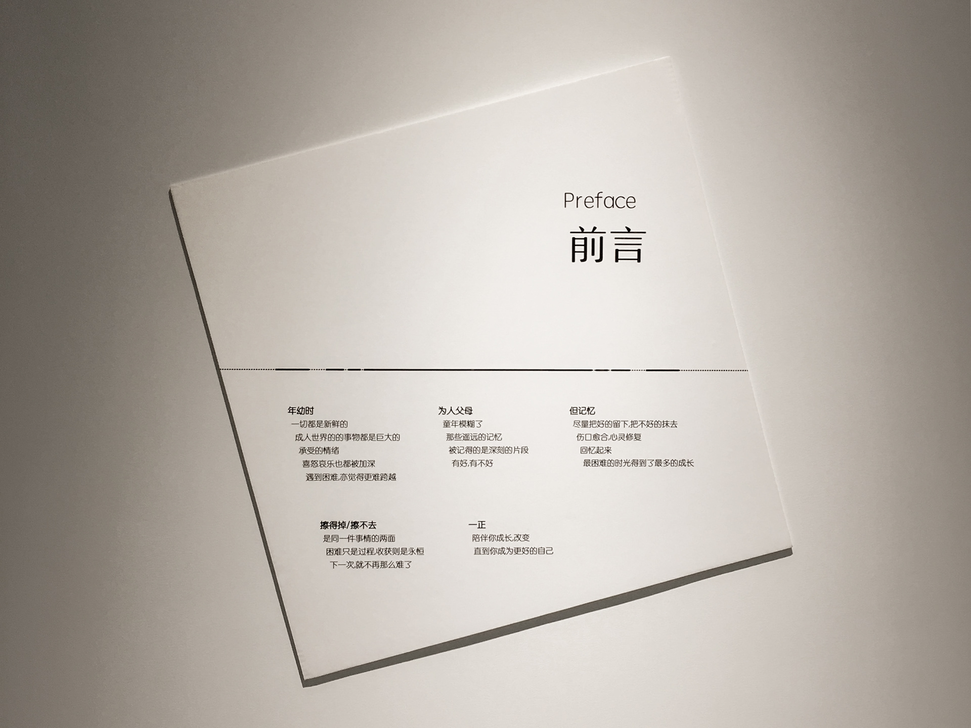
We all have good and bad memories from our childhood. But as we grow older, the bad ones tend to fade, leaving the good ones. This is the empowering message that we wish to convey to the parents and for them to tell their children. Everything has two sides to it. If we manage to overcome the short term difficulty, the reward is often life long. Once we overcome the unfamilarity of making friends, the resulting friendship could last a lifetime. From this concept, we developed five posters.
在品牌沟通层面,我们还是把重心放在最后受众和用户那里。亲子品类,虽然用户是孩子,沟通对象却是父母。因为前者只在乎东西好看、可爱,后者会在意更多,也有能力解析品牌层面的各种属性。这也为了后续市场端 2C 层面的沟通开个头,垫个基石。
每个人在儿时记忆里都有好的和不好的回忆。但很奇妙,我们都会慢慢把不好的擦掉,留下好的。我们希望父母能把这种正面激励的信息告诉孩子。事情都有两面,克服了眼前的困难,往往获得都是一辈子的。克服了陌生,就可能获得陪伴自己后半生的友情。所以就有了 “擦得掉/擦不去” 这个概念。因为一正橡皮擦已经不只是一种功能的满足,更多是一种情感的共鸣。我们为此创造了不同的 “擦不掉/擦得去” 的海报,视频是基于一个主题的展开版。
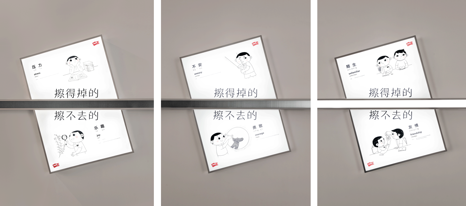
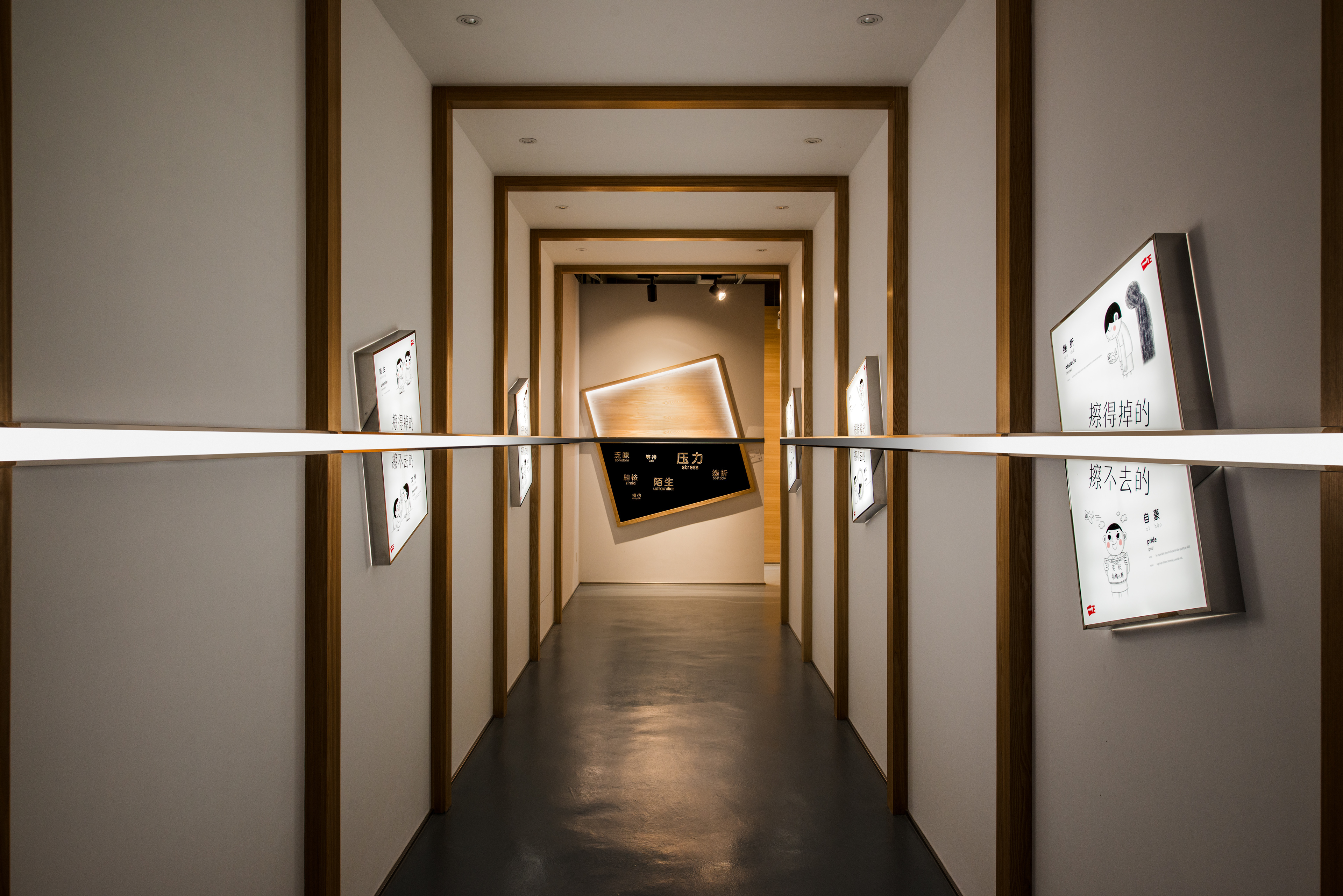
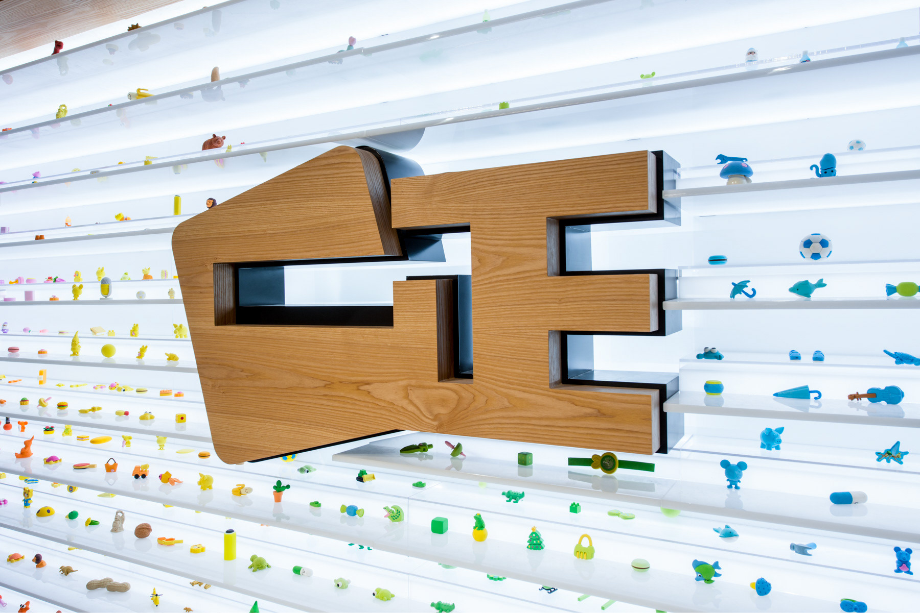
Concept Tunnel / 概念通道
Spatially, the tunnel is not only a transitional space. The 5 key posters are placed along the tunnel walls at a 15 degree angle (consistent with the incline in the logo). A line that shifts from black to shining white cuts the posters in half, emphasizing the two sides of the same story. This line is the spatial embodiment of the idea of what is erased away and what is not. Turning the corner the line ends at opposite sides of the tunnel, cutting across a black painting and a white painting. Looking forward and backward in the tunnel is like looking into the future and back at the past. With the right encouragement, we walk towards the white painting, and see the growth we have attained, only to turn back to realise we have overcome these obstacles that are on the black painting.
从空间角度,这个通道不只是起到一个空间转换的作用。这通道的墙上斜挂着这五福主题海报。15 度斜度来自 logo 原用的倾斜度。一条黑渐变到白色发光的线,贯穿了这些海报,分割了这些事情的两面。这条线就是主题 “擦得掉/擦不去” 的线。这条线再沿着通道墙折回通道两端。这两端分别有两幅画,白的 “擦不去” 的,和黑的 “擦得掉” 的。这像一个时间隧道,有了正确的引导,往前看,就看到了自己的各种擦不去的成长。回头看,原来克服了这么多困难,都被擦掉了。
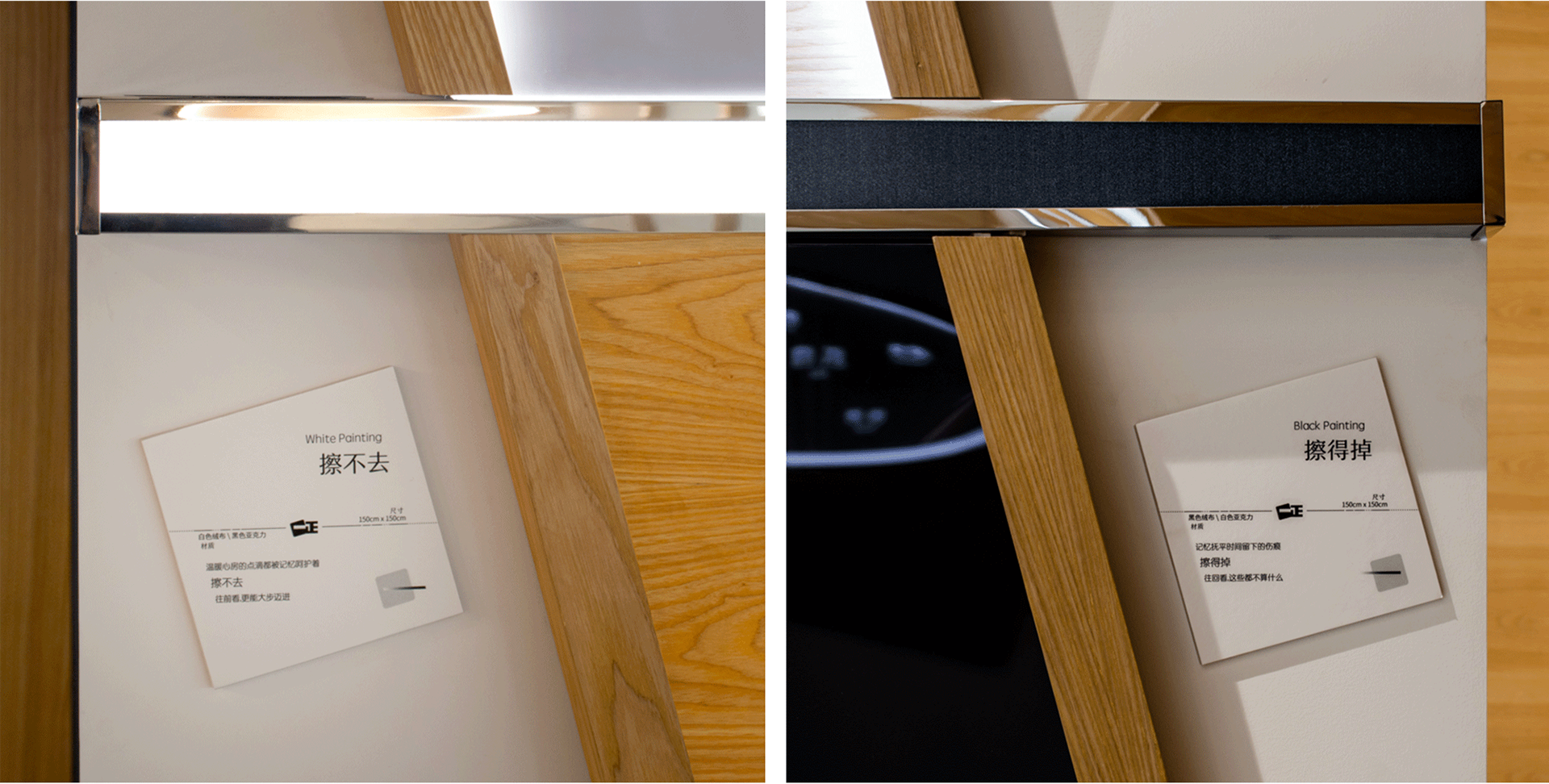
《 White Painting / 擦不去 》
温暖心房的点滴都被记忆呵护着
擦不去
往前看,更能大步迈进
《 Black Painting / 擦得掉 》
记忆抚平时间留下的伤痕
擦得掉
往回看,这些都不算什么
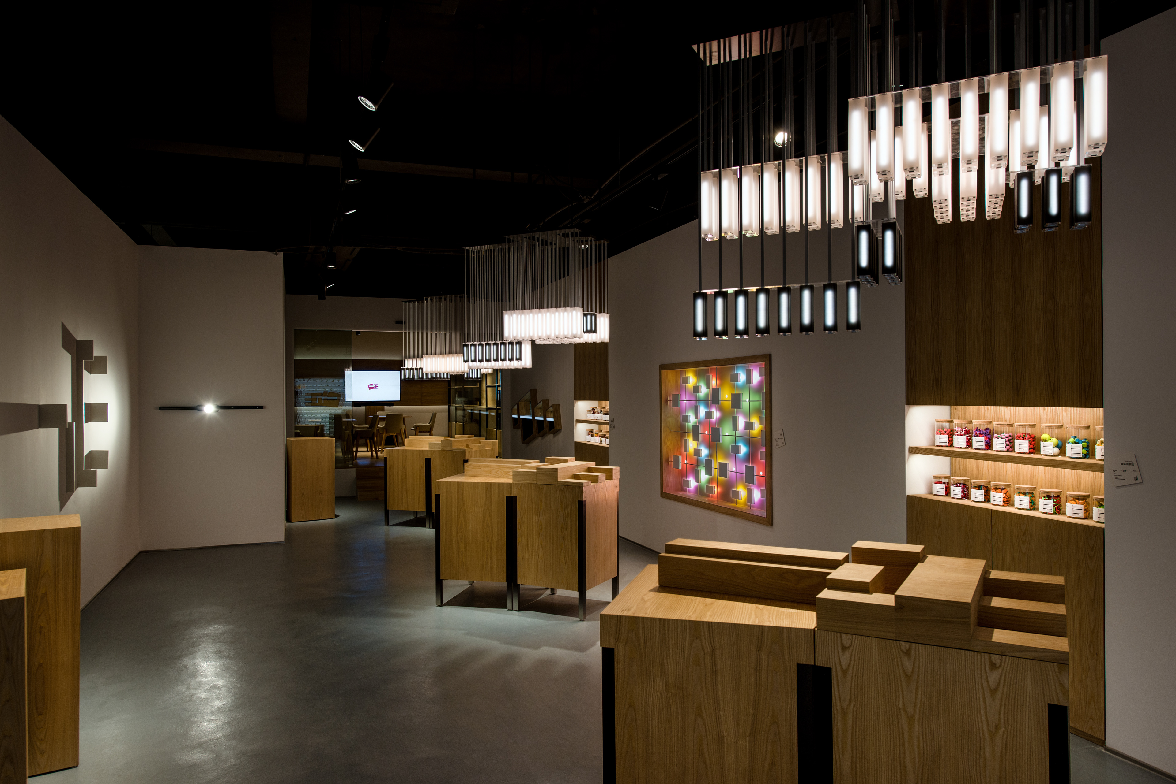
Experience Area / 体验区
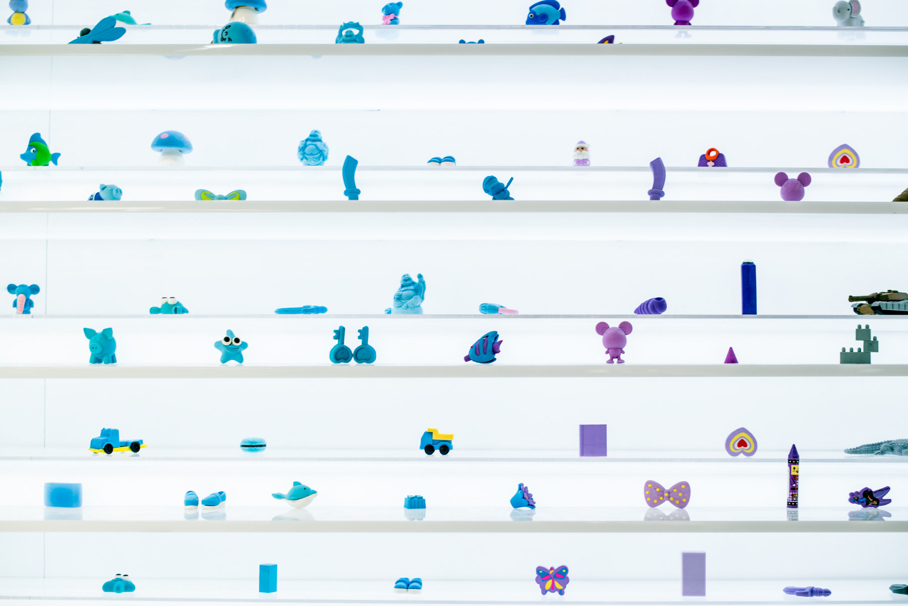
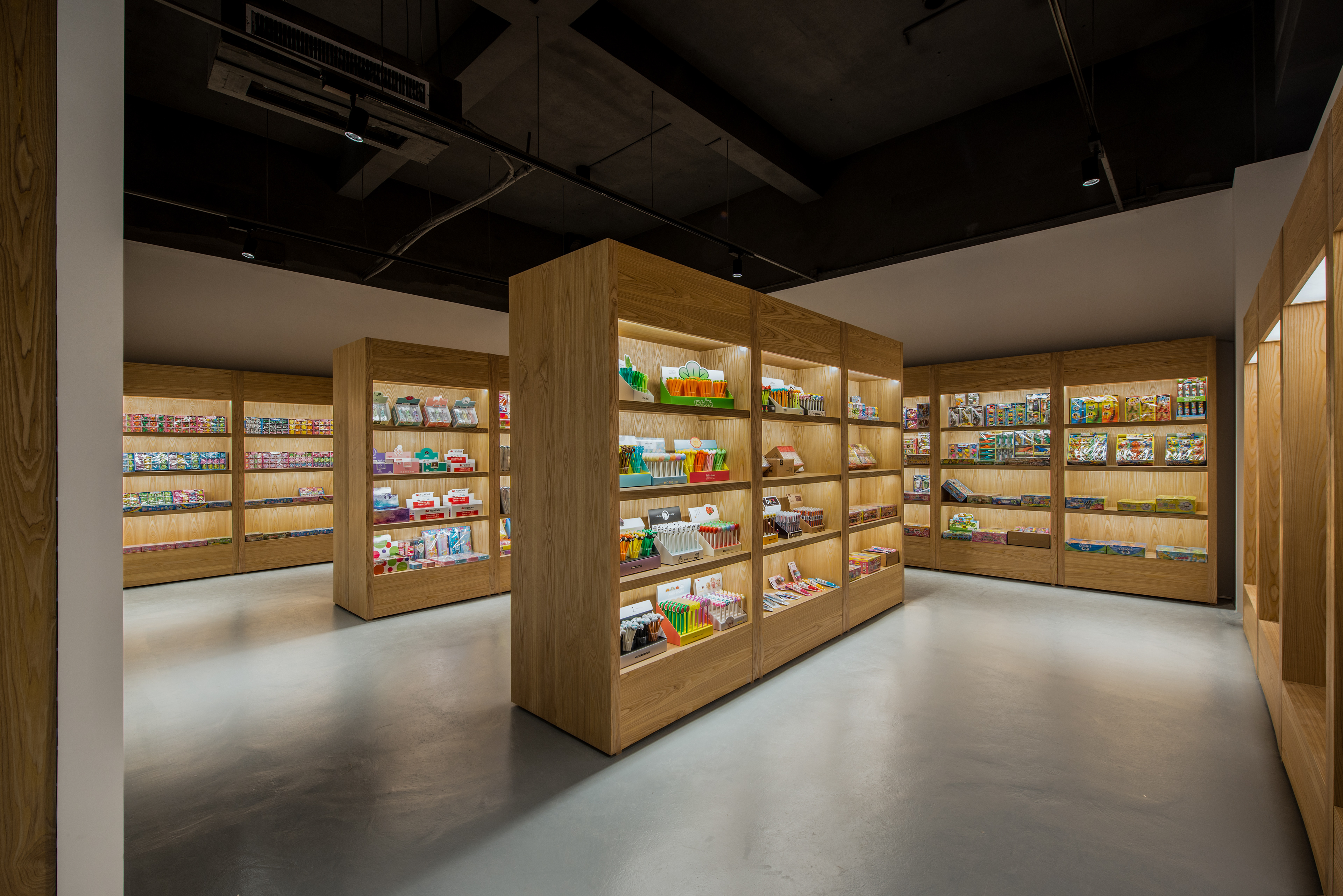
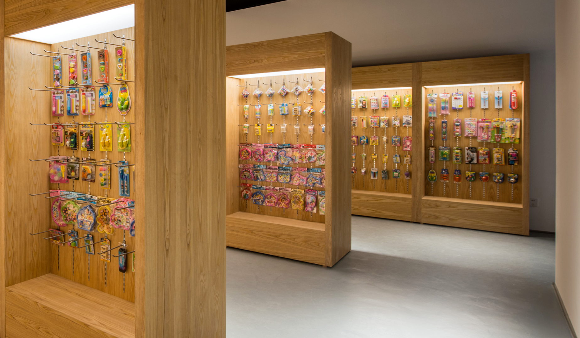
Many manufacturers likes to talk about how great they are. This is not only unconvincing, it is a sign of low self-esteem and lack of confidence, much like a person you meet who likes to brag. In initial discussions with the client, we reached the alignment that we will not talk, but actually demonstrate with real actions. The retail mockup area shows impressive product range. The acrylic wall displays an overwhelming numbers of erasers of all shapes and colours. How then do we demonstrate brand innovation, creativity, and constant pursuit of excellence? This is where we came up with delightful solutions.
很多传统制造企业,太在乎让人知道它们多厉害。但越这样越显得不自信。和客户的前期讨论,我们很默契一起打到这样的共识。我们不说自己多厉害,我们做出来。零售模拟区体现产品的多样性。亚克力墙赤裸裸的把这些产品呈现出来。如何沟通品牌的创新性和不断对产品的追求和研发呢?我们给到的是让人惊喜的解决办法。
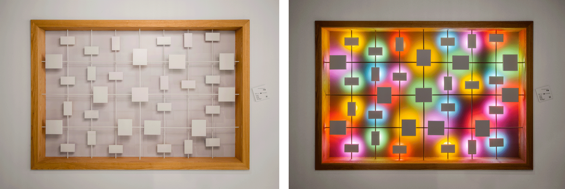
Before installation lights are turned on
After installation lights are turned on
Rubber Light Installation / 橡皮灯光装置
We installed two rubber light installations. One is a play on shadow, another on colour. White rubber blocks protrude from the wall in seemingly random fashion, only when the light is turned on do the Yizheng chinese characters come into being. In the second we used light reflected off coloured rubber blocks to compose a painting with light. Both are dramatized by the before after effect in the storytelling with light.
体验区里有两幅橡皮灯光装置。白色橡皮块,突出于墙面,没开灯前长得莫名,灯开了后投射出一正品牌字样。这寓意了一种品牌无影随行的陪伴。另一幅,用光打在彩色橡皮块的反射来构图。彩色橡皮快的反面是白色。这两幅都是用一种开灯前后的反差来叙述背后的故事。
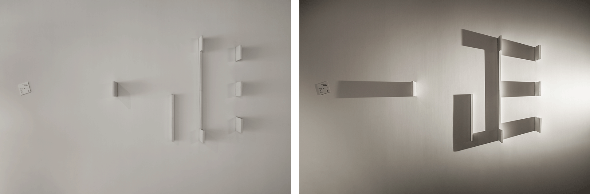
Shadow Light Installation / 光的脚印
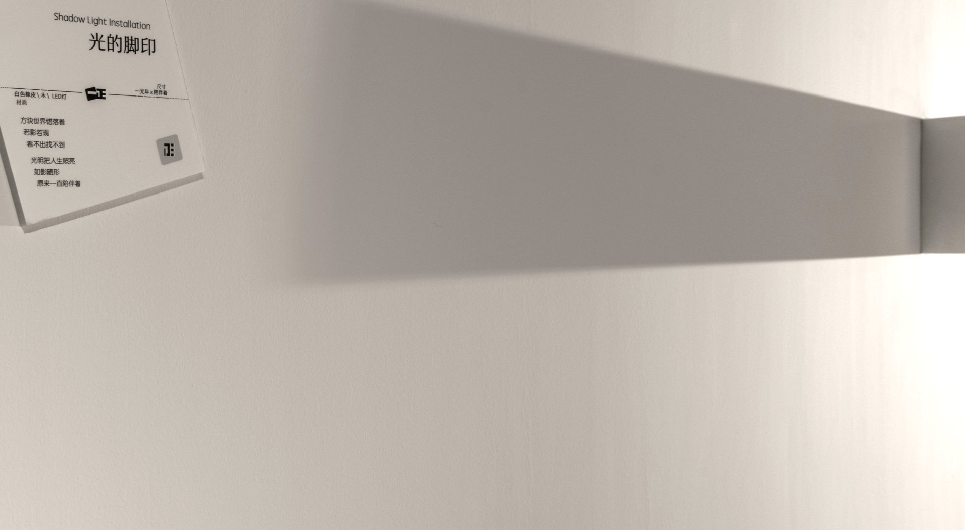
《 Shadow Light Installation / 光的脚印 》
方块世界错落着
若影若现
看不出找不到
光明把人生照亮
如影随形
原来一直陪伴着
Coloured Light Installation / 斑斓
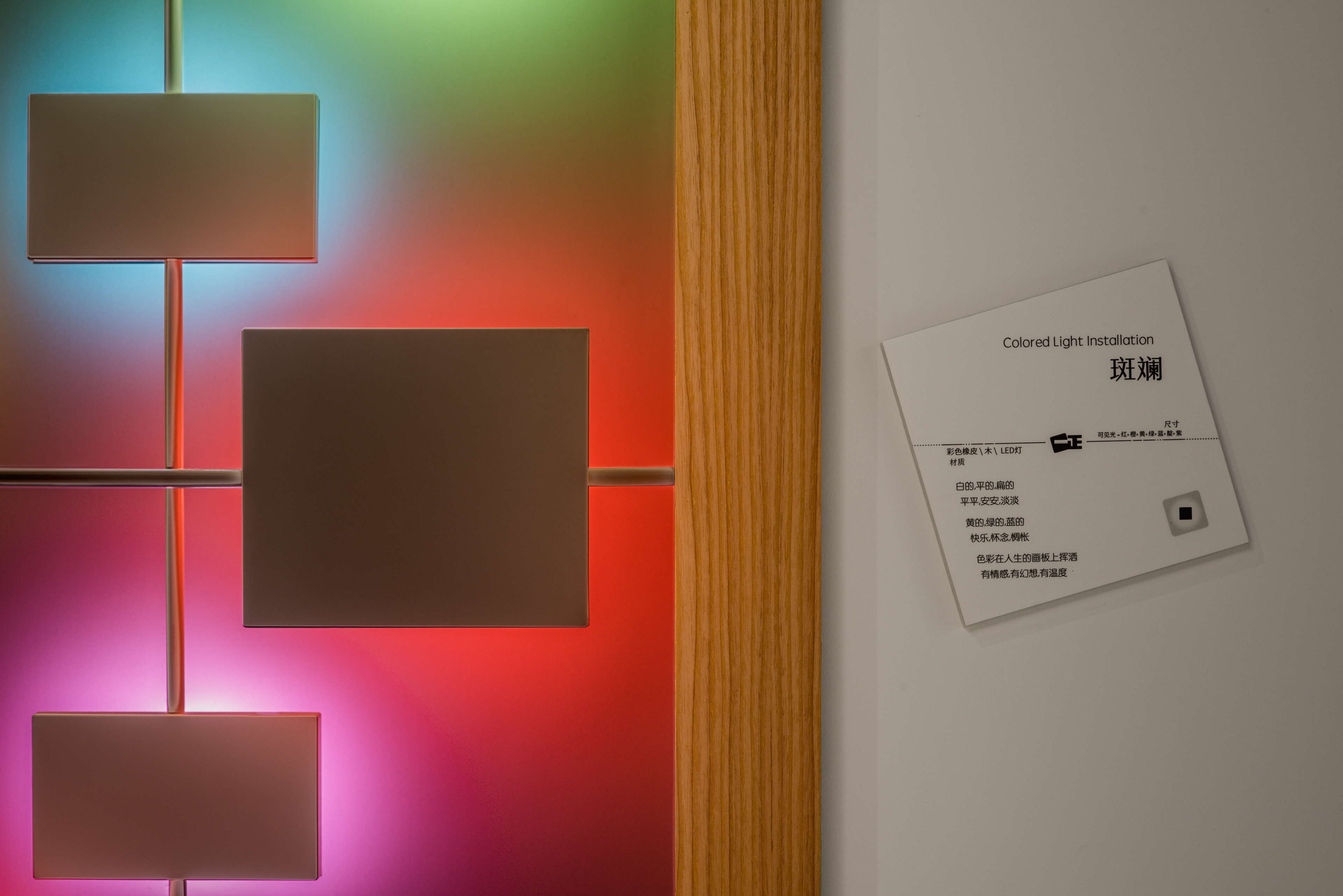
《 Coloured Light Installation / 斑斓 》
白的,平的,扁的
平平,安安,淡淡
黄的,绿的,蓝的
快乐,怀念,惆怅
色彩在人生的画板上挥洒
有情感,有幻想,有温度
Before
After
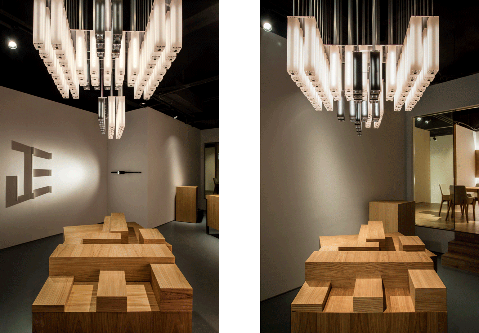
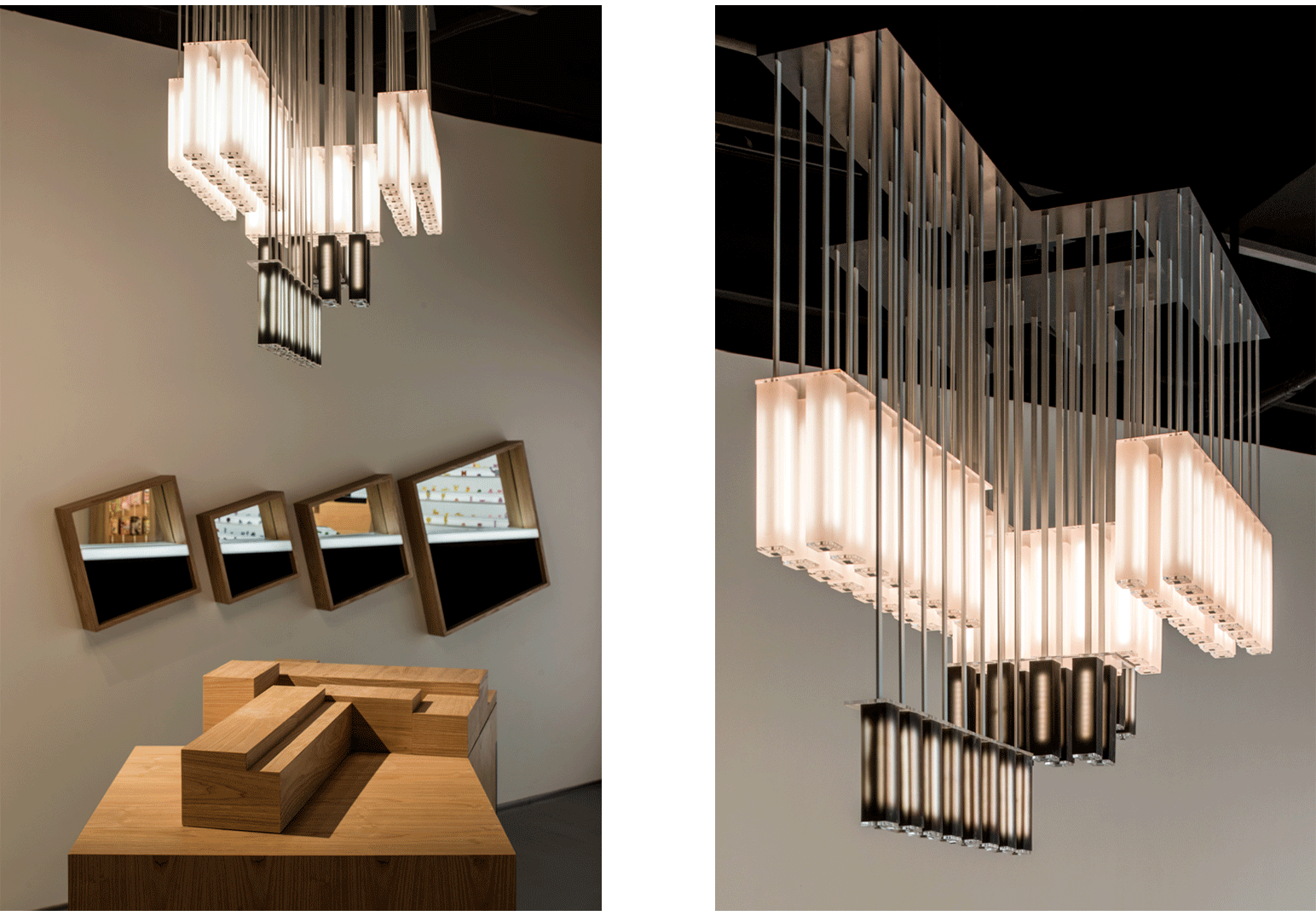
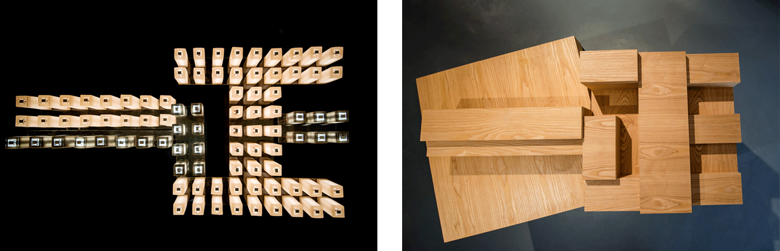
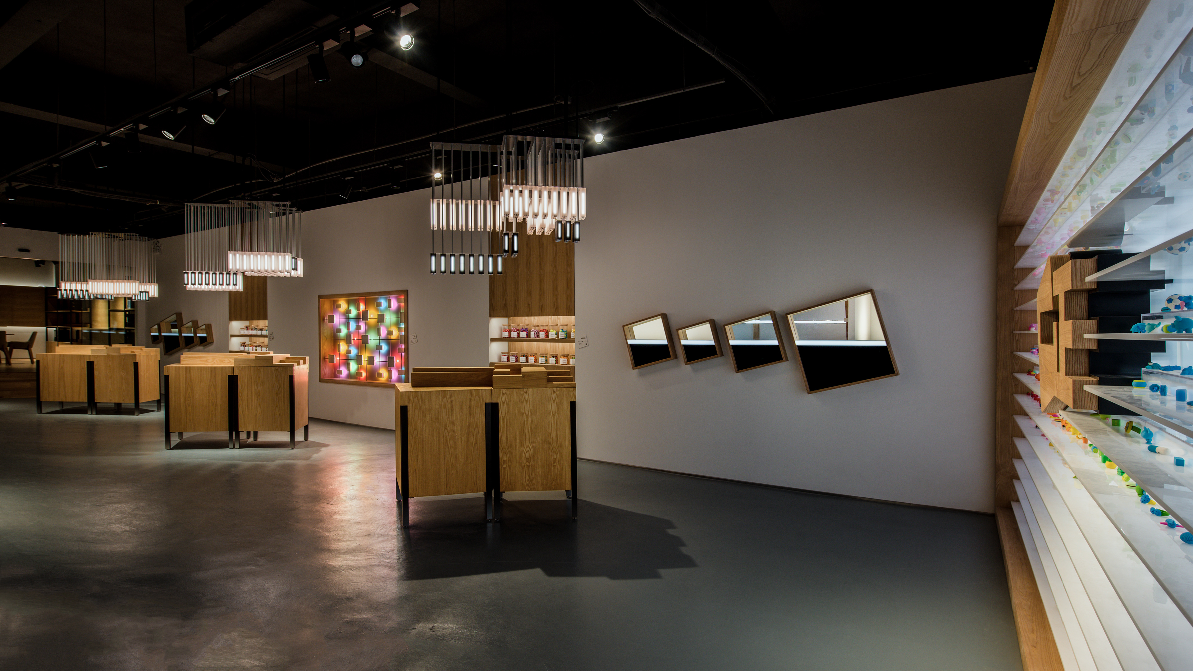
Rubber Pendant Lights + Podium / 橡皮吊灯和站台
Besides the light play, we wanted to make something surprising for which rubber is suited for yet seldom considered. We experimented with making rubber light fixtures, and after numerous prototyping rounds, they turned out amazingly well. It took a while to get the right mix of both rigidity and translucency in the white and black rubber tubes. We made 3 sets of these rubber chandeliers, and they are configured differently elevation wise. But from a bottom looking up, it spells the chinese characters of Yizheng, being a mirror image of the wooden blocks on the podium below.
除了灯光装置,我们也想把橡皮用在一个不寻常,但很合适的东西上。萌生了橡皮吊灯的想法。在数次打样和调整后,后果出乎所有人所料! 多次尝试后才找到了对于黑色和白色橡皮合适的橡皮配方,对于通透性和坚韧性的准确平衡。我们制作了三组像水晶灯的橡皮吊灯,从立面角度看各有差别,但从下往上看,他们都写着一正,和下面站台形成了天与地的呼应。
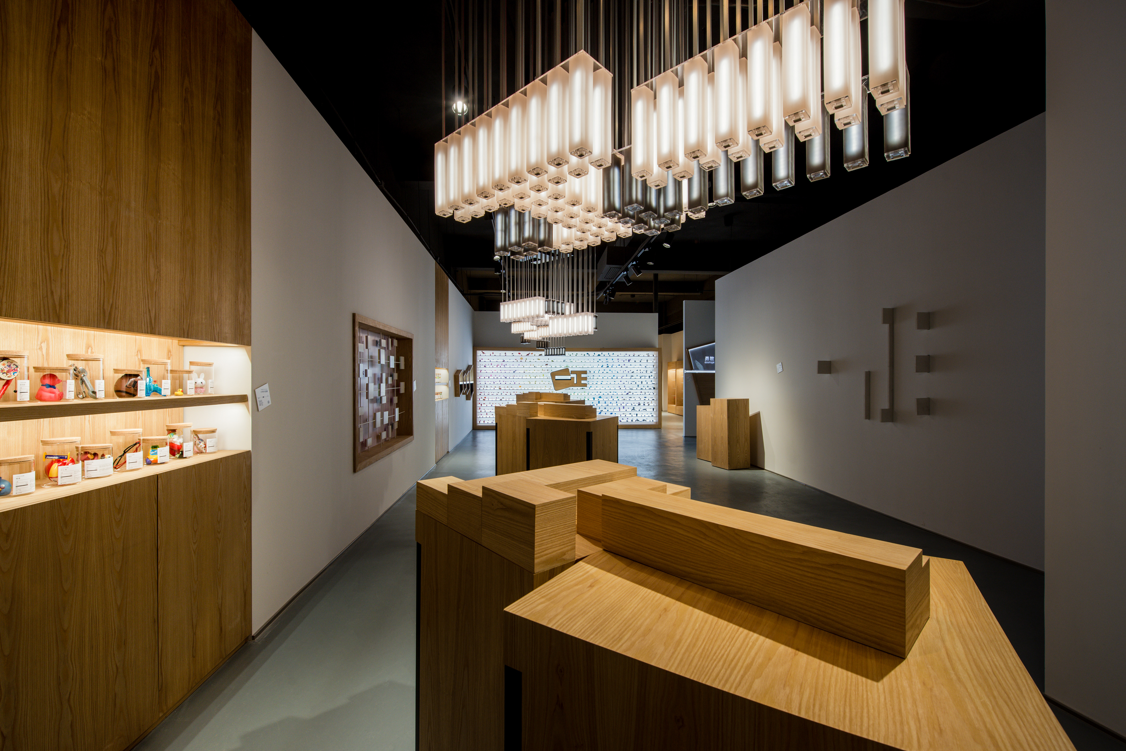
Product Showcase Acrylic Wall / 产品橱窗亚克力墙
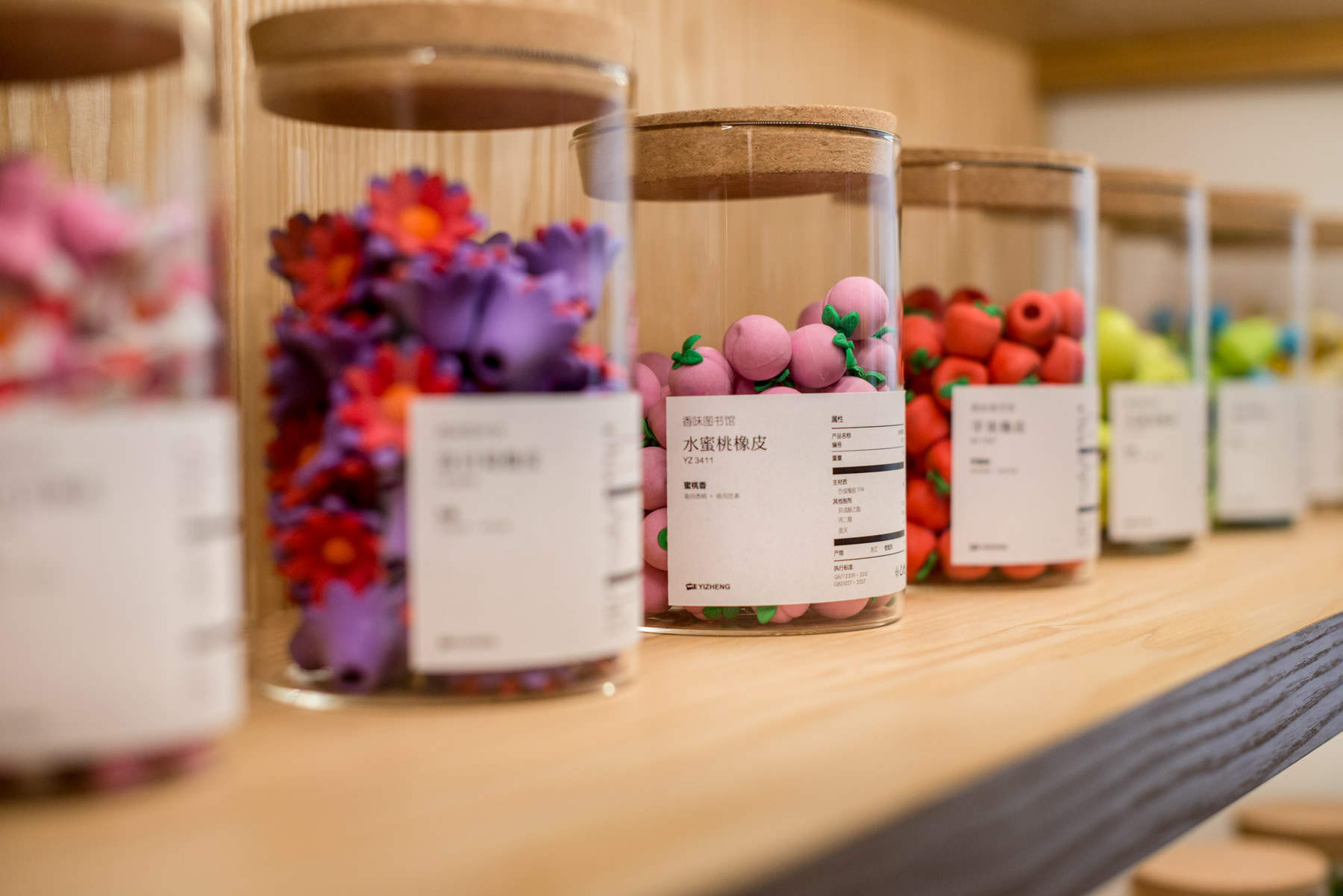
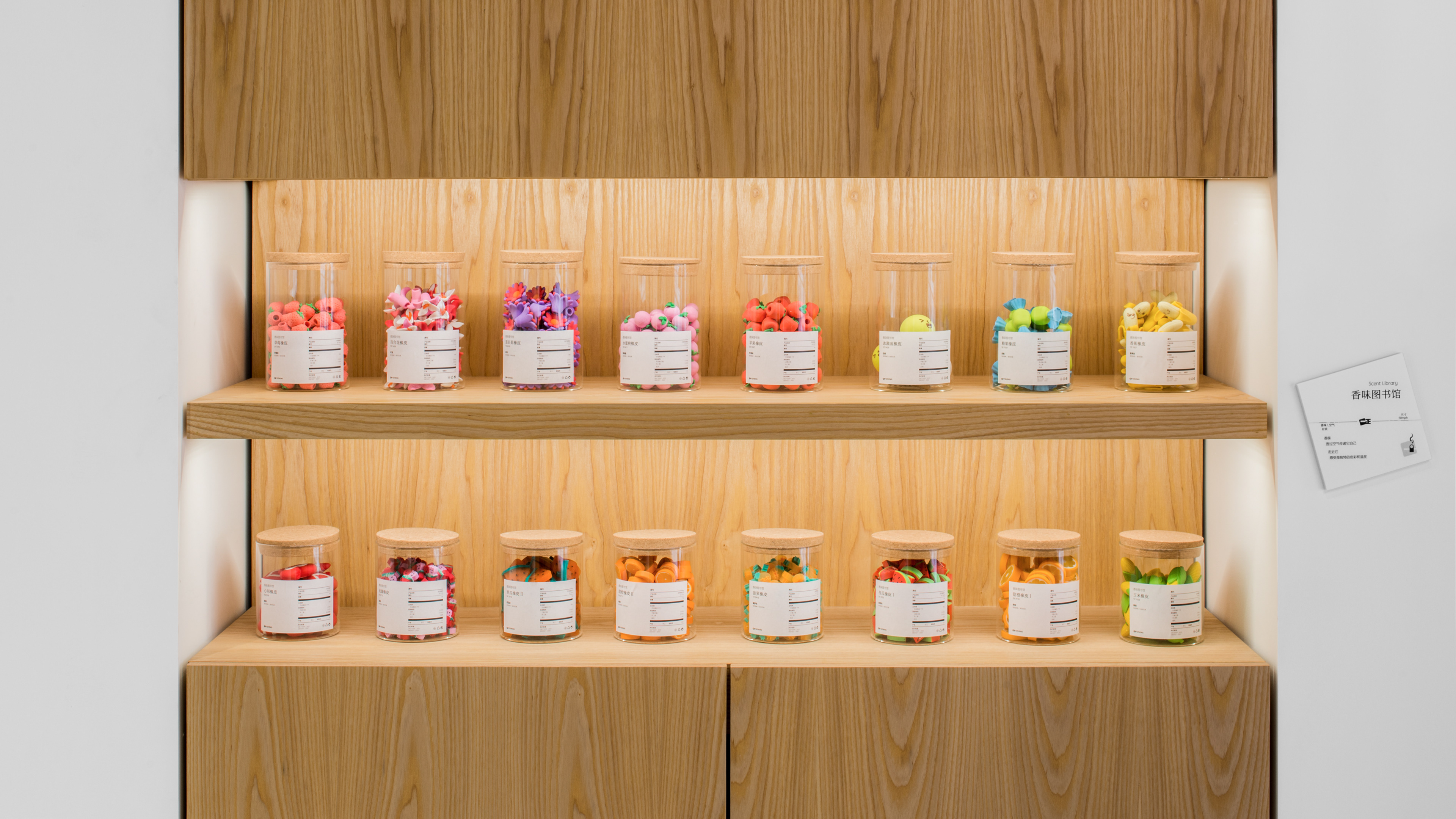
Scent Library / 香味图书馆
Here, we want to showcase the fact that Yizheng products uses food quality colouring and scent additives. Safety is especially important to parents. We placed the erasers in jars, and for the guests to open them and smell. This adds a level of interactivity without the message being too in your face.
一正橡皮擦使用的是食用级别的色素和香精。这对于父母是很重要的信息。我们把这些香味橡皮放进了罐子,让参观者能打开,自己闻各种香味,增加互动性。
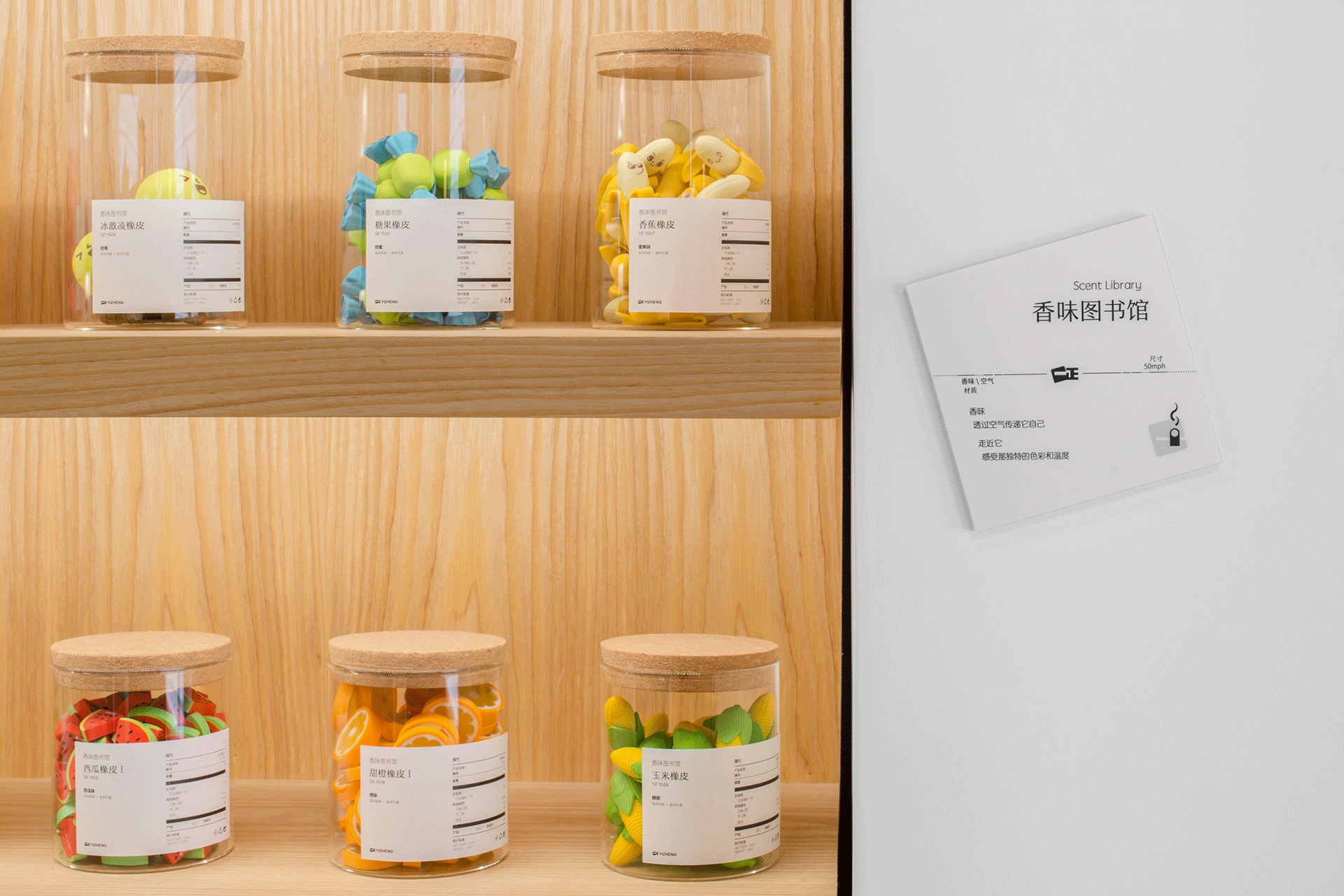
《 Scent Library / 香味图书馆 》
香味
透过空气传递它自己
走近它
感受那独特的色彩和温度
透过空气传递它自己
走近它
感受那独特的色彩和温度
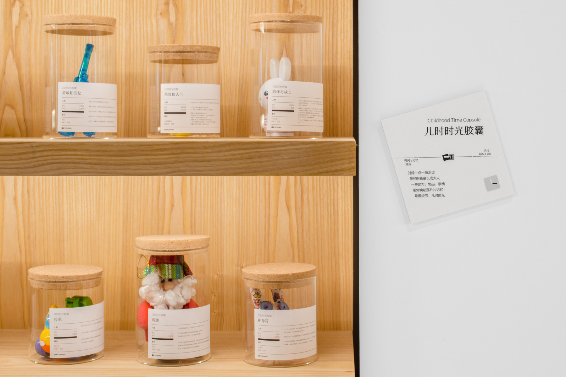
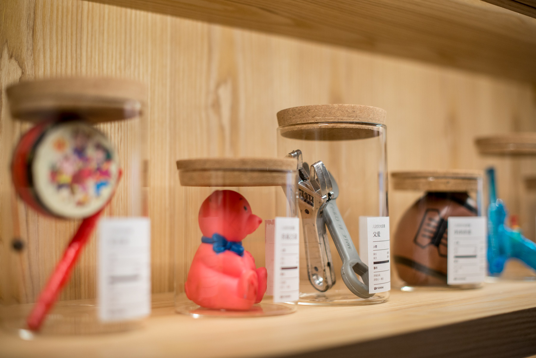
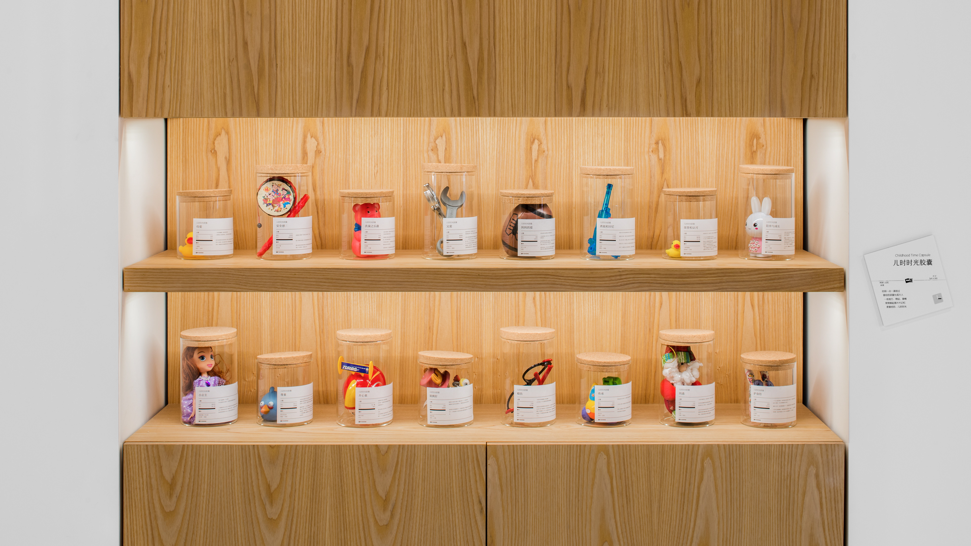
儿时时空胶囊 / Childhood Time Capsule
In our consumer interviews, we found that Yizheng erasers were not just functional, really they are like companions to the children. We set up here a rotating exhibit, for parents to share the items that made an emotional connection with their children. And on the labels, we printed the names of parents and kids, as well as the story behind the exhibit. Each exhibit is a time capsule, a snapshot in time, left here on loan.
在我们的消费者访问里,我们发现一正橡皮擦不只是功能性的,更重要它扮演了玩伴的角色。这些展品在孩童记忆里都有着一段故事。我们把家长和孩子的名字放在标贴上,包括背后的故事。每一件展品都是一个时空胶囊,一个写照。
《 Childhood Time Capsule / 儿时时空胶囊 》
时间一点一滴划过
曾经的孩童长成大人
一些地方,物品,事情
常常唤起那片片记忆
是曾经的,儿时时光
曾经的孩童长成大人
一些地方,物品,事情
常常唤起那片片记忆
是曾经的,儿时时光
Retail Mockup Area / 零售模拟区
Conference Room / 洽谈区
There's More! / 还有呢!
This is just one part of the branding project.
For more, pls see our other project, Yizheng Brand Video.
这个视频是这次品牌重塑的一部份。
请查看,一正品牌视频。
Our Team/合作团队
This was a project that involved many amazing people in different places working together. Say hi everyone!
这次的合作不只是跨界,更是跨国界,跨地域的一次碰撞。和大家打声招呼!
Client: Yizheng Stationery, www.yzstationery.com
Overall Concept, Interior, Graphic Design: United Design Practice (Beijing), www.uniteddesignpractice.com
Animation & Illustration: Seenvision (Beijing), www.seenvision.net
Music Composition: Tze Toh (Singapore), www.tzetoh.org
Construction & Engineering: NFH (Shanghai), www.newfuhe.com
Lighting Design: Light Collab (Singapore), www.lightcollab.com
Photography: Shawn Koh (Beijing), www.fengstudios.com